Altium Designer's Explorer panel provides a direct interface to your managed content server. From the Explorer panel you can perform many activities, including:
- Create and manage the organizational structure used in the server
- Create any number of Items, each representative of a design object
- Review and manage the lifecycle of Item revisions
- Interrogate the usage of a particular Item revision (Where-Used)
- Browse and manage supply chain information for Component Items
This page pulls together some tips, tricks, and cool functionality that may otherwise be missed amongst the feature-rich environment of the panel. Think of this page more as a 'crib sheet', presenting a collection of features that can really enhance your productivity when working with the Explorer panel.
For your day-to-day activities in the realm of component management, especially with respect to managed components in your managed content server, you'll make frequent use of the
Components panel. This panel provides a powerful interface with which to interact with all your components - both managed (server-based) and library (file-based). And for your managed components, the panel provides a filter-based parametric (faceted) search capability, for specifying target component parameters. In addition, the panel also offers options to edit a managed component through the Component Editor (in its
Single Component Editing mode), view the component in its source server, and perform component management functions such as component creation and cloning, or editing the selected component's Part Choices and Type. In short, the
Components panel offers a streamlined, targeted interface to aid your component management activities, without having to venture into the
Explorer panel.
The Explorer panel provides a direct interface to your managed content server from within Altium Designer.
Changing the Working Server
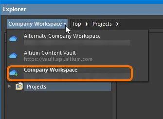
The Explorer panel can only interface to one managed content server at a time. The field at the top-left of the panel indicates the currently active server - the server whose content you will be able to browse and modify. To select a different server, click on the server name and choose a different server from those currently connected.
Access controls for changing the working server.
All currently connected servers - the Active Server and those from the
Known Servers list for your instance of Altium Designer - are presented on the
Data Management - Servers page of the
Preferences dialog. Note that in the
Explorer panel all connected servers will be listed, but only one will be active and is distinguished by the inclusion of the
icon, and its name in bold.
Folder Content Loading
When you click on any folder within the Server Folders structure region of the Explorer panel, only a portion of that folder content will be initially loaded, where applicable to do so. This greatly decreases the folder's initial load time. As you scroll to the end of the initial content, an additional portion of Items in that folder will be loaded.
To have all content for the folder loaded, click the
button at the top of the panel, and use the
Load all pages option on the associated menu to switch from portion loading of folder content (option disabled), to full loading of folder content (option enabled).
Moving Folders and Items
One or more server folders, or Items within a folder, can be quickly moved using the drag and drop technique:
- Folders - select the folder(s) to be moved (using standard Ctrl+click, or Shift+click techniques), then click, drag, and drop the selected folder(s) at the required place in the structure, as indicated by a horizontal indicator.
- Items - select the Item(s) to be moved (using standard Ctrl+click, Shift+click, or Ctrl+A techniques), then click, drag, and drop the selected Item(s) onto a different folder in the structure.
Folders and Items can also be moved using the corresponding command available from the right-click menu (the command will reflect whether one or multiple folders/Items are being moved). Launching a command will give access to a dialog in which to select the target folder under which the folder(s) should be moved, or the Item(s) should be placed into, respectively.
Deleting a Folder
Server data is valuable and cannot be recovered once it is deleted. For this reason you must first delete all included Items before you can delete the parent folder. Once that is done, you can delete the empty folder using the right-click Delete Folder command.
Further streamlining the organization of your server folder structure, support is provided for deleting multiple empty folders in a single action:
- Selected Folder Deletion - select the empty folders (using standard Ctrl+click, or Shift+click techniques), then right-click on the selection and choose the Delete Folders command.
- Recursive Folder Deletion - delete a tree of empty folders using the right-click Delete Folder command at the parent folder level. Both the parent and all descendant child sub-folders will be included in the deletion.
Drag & Drop Placement
Placement of certain server Items into a PCB design project in Altium Designer is streamlined with the ability to drag & drop revisions of these Item types onto the active (and applicable) document, directly from the Explorer panel. Support is available to drag:
- A revision of a Component Item onto the active schematic document (or PCB document). The applicable model for the chosen domain will appear floating on the cursor accordingly.
- A revision of a Managed Schematic Sheet Item onto the active schematic document. A sheet symbol that references the sheet will float attached to the cursor.
- A revision of a 3D Model Item onto a PCB or PCB Library document, creating a 3D Body object that references that Item Revision.
Browse your server for the required Item to be placed. Placement involves a specific revision of that Item, so be sure to expand the main Item entry to list all of its available revisions (click the button at the top-right of the panel and disable the Show only latest option to see all previous revisions). Then click on the required revision and drag an instance of it onto the design document.
Drag and drop the top-level entry for an Item itself, to place an instance of the latest revision of that Item.
Drag & Drop places a single instance of the Item Revision. If you need to place multiple instances, right-click on the required Item Revision (or top-level Item entry for the latest revision) and use the Place command.
In addition, Altium Designer supports access to, and placement of managed components from, the Components panel. For more information, see the section Placement from the Components Panel, on the page Working with Managed Components.
Batch Download of Items
The Explorer panel supports the ability to select multiple Items in a managed content server, and have the source entities for those Items downloaded, en masse, into a newly created single source library or folder, as applicable. The following Item types are supported by this feature:
- Symbol Items - with the symbols for the selected Items downloaded into a Schematic Library (
*.SchLib
).
- Footprint Items - with the 2D/3D component models for the selected Items downloaded into a PCB Library (
*.PcbLib
).
- Component Items - with the selected Component Items downloaded into a Zip archive file containing source symbol and model libraries, and a source Integrated Library Package (*.LibPkg).
- Simulation Model Items - with the released data applicable to each Item in the selection (
*.SimModel
, *.mdl
, *.ckt
) downloaded to a separate sub-folder.
Batch Download of Symbol Items
To download multiple Symbol Items:
- Browse to the server folder containing the Symbol Items of interest.
- Select the Items required for download, using standard multi-select controls (Ctrl+click, Shift+click).
- Right-click on the selection and choose the Operations » Download selected symbol in library command.
- Use the Choose destination file dialog to determine where, and with what name, the new Schematic Library file is to be generated.
- Click Save - the SchLib will be created, with progress displayed in a dedicated Downloading dialog.
Once the download is complete, the Downloading dialog provides the ability to explore the downloaded content within Windows Explorer (click Explore), or to open the library within Altium Designer (click Open).
Each symbol is named using the source Item's Name field.
Batch Download of Component Items
To download multiple Component Items:
- Browse to the server folder containing the Component Items you want to download.
- Select the revision of the Component Item(s) you want to inlcude in the download. You can only choose one revision of a particular Component Item (typically the latest revision), but can include as many different Component Items in the download as required.
- Right-click on an entry in the selection and choose the Operations » Download selected component to zip command from the context menu.
- In the Save As dialog, specify the name, and location, for the generated Zip file. By default, the file will be named in the format Components - <Date> - <Time>.zip.
- Once ready, click the Save button to proceed with the download, and generation of the Zip file. An Integrated Library Package (*.LibPkg) will be created, with source SchLib (with symbols, parameters and model links) and PcbLib (with footprint models) files generated and added. This is then compressed into the Zip file, which is generated in the specified folder. An information dialog will confirm successful generation of the file.
Use the source in the Zip archive to quickly generate an integrated library containing your chosen component(s).
Batch Download of Simulation Model Items
To download multiple Simulation Model Items:
- Browse to the server folder containing the Simulation Model Items of interest.
- Select the Items required for download, using standard multi-select controls (Ctrl+click, Shift+click).
- Right-click on the selection and choose the Operations » Download selected sim model to folder command.
- Use the Browse For Folder dialog to determine the parent download folder for the models.
- Click OK - the download will proceed, with progress displayed in a dedicated Downloading dialog.
Once the download is complete, the Downloading dialog provides the ability to explore the downloaded content within Windows Explorer (click Explore).
Within the destination folder, a sub-folder for each Item in the selection will be created, named using the Item-Revision ID. The release data can be found in the Released
sub-folder therein.
Batch Lifecycle State Changes
Related page: Managing Lifecycles for Items
All of the design Items stored in your managed content server have a Lifecycle State. The lifecycle state is used to reflect the readiness of that Item for use, for example an Item might be New From Design, In Production, or Deprecated. The lifecycle state of multiple Items can be changed in a single batch process.
To perform a batch change:
- Select the required Items in the Explorer panel.
- Right-click and choose the Operations » Change state command from the context menu.
- The Batch state change dialog will open. The Next State column will default to the next lifecycle state for each Item involved. This can be changed on an individual Item basis, but editing of multiple selected entries in the column is also supported, for quickly setting the required state across Items.
- Once the Next State has been set as required, click the Process button to effect the lifecycle state changes.
- A Confirm dialog will appear, enter a comment if required (this is stored as part of the Item History) and click Yes to complete the batch lifecycle state change.
An example of quickly changing the lifecycle state of two Component Items.
Clickable URLs
Further improving the usability of managed content servers, the Explorer panel supports clickable URLs. This functionality can be found in a variety of relevant areas, including:
- Clicking on a Component Item's parameter whose value is a URL, opening the target page in an external Web Browser.
- Clicking on a URL in the supply chain data for a Component Item, opening the target page in an external Web Browser.
- Clicking on a document in the Released Documents region - from the Preview aspect view tab for a revision of a PCB Fabrication Data Item, PCB Assembly Data Item, or PCB Project Design Item - to open that document.
For Component Item parameters and Released Documents of a Project-related Item, this functionality is also available when viewing the full details for an Item, directly in Altium Designer. To access this view, right-click on the Item's entry in the Explorer panel, and choose History from the context menu.
Clickable Component Parameter URLs
For a released Component Item in a managed content server, the Preview aspect view tab presents a region for that component's parameters. For a parameter whose value is a URL - such as a datasheet, package specification, or manufacturer's website - click the URL to open it in an external Web Browser.
The value for such a parameter can be a URL-link (starting http:// or just www.), an FTP-link, a link to a shared network folder, or a link to a local folder.
If the link is to a PDF document, that document will either open within the browser, or in an external PDF reader - in accordance with options configured for your browser.
Example clickable Parameter URLs on the Preview aspect view tab for a Component Item in the Explorer panel.
Clickable Supply Chain URLs
Each released Component Item in a managed content server can have defined supply chain data, in the form of Part Choices. These are presented on the Part Choices aspect view tab. The actual supply chain intelligence is sourced from the server's local Part Catalog and the relevant Part Source - either the aggregate parts database of the Altium Parts Provider (which itself interfaces to, and gathers the parts from, enabled Suppliers), or a linked local parts database (a Part Source configured as a Custom Database Parts Provider, and where supported by your specific type of managed content server). Clickable URLs associated with each part choice are:
- Manufacturer Name and Manufacturer Part Number - a clickable link to the Octopart website, providing detailed information on that manufacturer part.
- Supplier part number (in an SPN tile) - a clickable link to that part on the supplier's website.
Click a URL to open it in an external Web Browser.
Example clickable URLs associated with a defined Part Choice for a Component Item in the server.
Clickable Released Document URLs
After releasing a board design project - either the fabricated bare board (PCB Fabrication Data Item) or an assembled board (PCB Assembly Data Item) - you can open any of that design's documents. First, ensure you are viewing the folder for the required project in its Classic View (click the button at the top right of the Explorer panel and choose the Classic View command from the context menu). Browse to the applicable Item Revision and switch to that revision's Preview aspect view tab. Then, in the Released Documents region, hover over a generated output document - the cursor will change to a hand cursor, synonymous with URLs. Click on one of these URLs to open that document. Those documents native to Altium Designer will be opened directly for viewing within Altium Designer. For non-Altium Designer documents, such as output PDF files, or Excel-format BOMs, these will be opened directly in the relevant software application (provided it is installed).
This functionality is also supported for the design source - released automatically into the next revision of the relevant PCB Project Design Item, when using the
Project Releaser. Documents are opened for viewing in non-editable, Read-only fashion. For individually-opened schematic documents, a watermark is used to reinforce this fact.
A document can also be opened for viewing by using the View command from the right-click context menu.
Click to open a released document. Those document types that are not native to Altium Designer will be opened in their respective applications (where available).
Support for Multi-Part Components
When viewing the symbol for a multi-part Component Item, the Preview aspect view tab will present each part - each with its own distinct symbol graphic - as a separate tab. In addition, the Place menu will present a sub-menu of all applicable parts that can be placed for that Component Item.
Previewing
Browse to the multi-part Component Item of interest, in the managed content server, and ensure the Preview aspect view tab is active. Each distinct part's symbol can be browsed in the symbol viewing region. Click on a tab along the bottom to switch between parts.
Browsing the parts of a multi-part Component Item, at the component-level.
Double-click on the entry for the child Symbol Item to browse the constituent parts for the component at the symbol-level. Again, ensure the Preview aspect view tab is active.
Browsing the parts of a multi-part Component Item, at the child symbol-level.
Placing
When placing a revision of a multi-part Component Item onto a schematic sheet, right-clicking on the revision's entry and hovering over the Place command on the menu will present a sub-menu containing all parts for that component. Select the required part to place.
If using the Explorer panel's drag and drop placement functionality, be aware that only the first part (Part A
) for the component can be placed.
A placement sub-menu offers all parts in a multi-part Component Item.
Ability to Copy-Paste Server Folder Structure
Adding greater flexibility to the management of your server content, the Explorer panel provides the ability to copy and paste a folder (and its descendant structure). This essentially allows you to quickly clone areas of your server folder structure, which can prove a real time-saver when readying your server for a deluge of component data, for example, where structure is similar, with a parent folder and sub-folders for the various domain models.
To use this feature:
- Select a folder in your existing folder structure, whose structure you wish to copy.
- Right-click and choose the Operations » Copy Folder Structure command from the context menu.
- Select the folder under which you want the cloned folder structure to be pasted.
- Right-click and choose the Operations » Paste Folder Structure command from the context menu.
Once pasted, you can make adjustments to the cloned folder structure as required.
You can only copy a single selected folder (and its descendant structure). The commands will be unavailable if multiple folders are selected.
Note that on paste, only the folder structure is pasted - Items within the copied folder structure are not copied.
Remember that when pasting, two folders cannot have the same name in the same area of the folder structure. Trying to do so will result in a Duplicate Folder HRID error. And while the parent folder will not be pasted, its descendant structure will be, and at the top level of the folder structure. So if you are trying to quickly create a set of cloned folders under the same parent area of the 'tree', what you can do is paste the folder structure to another temporary area of the main server folder structure. Then rename the top level folder, make any other adjustments, then drag and drop back to where you really want the folder to be.
Item Revision Comparison
Using the power of Altium Designer's native file format comparison technology, the managed content server supports the visual comparison of two revisions - of the same, or different Items - for a range of supported content types, directly from within the Explorer panel. Revisions of Items of the following content types can be compared:
- Component Item
- Symbol Item
- Footprint Item
- Managed Schematic Sheet Item
- Schematic Template Item
- PCB Fabrication Data Item
- PCB Assembly Data Item
- PCB Project Design Item
Within the Explorer panel, browse to the relevant folder, select the two Item-Revisions that you wish to compare, then right-click and choose Operations » Compare from the context menu.
Comparing Two Component Item Revisions
When comparing two Component Item revisions, after clicking Compare a sequence of events takes place:
- The referenced Footprint Item revisions are compared.
- The referenced Symbol Item revisions are compared.
- The parameteric data for the two Component Item revisions are compared.
The results of the comparison are presented in the Compare component revisions dialog.
Example comparison of two revisions of a Component Item.
The dialog is divided into three distinct sections, showing the results of comparsion for the parametric data, footprints, and symbols. If values for parameters are not identical, they will be highlighted with a reddish background. For footprints and symbols, text will either state they are Identical or Not identical.
Disable the Show unchanged option to leave only those elements that are not identical.
For symbols and footprints, you can run a comparison on the corresponding referenced Item Revisions - directly from the Compare component revisions dialog - by clicking the associated Compare control.
Comparing Two Symbol Item Revisions
When comparing two revisions of Symbol Items, after clicking Compare a graphical comparison is made and any differences that are detected will be listed in the Differences panel. The SchLib documents for the two revisions are opened within the workspace - by displaying them side by side in the design editor window, you can peruse the differences graphically. Clicking on a top-level folder for a detected difference will highlight that difference on both documents simultaneously.
This is the same functionality as if running the Project » Show Physical Differences command on the two source documents.
Example comparison of two revisions of a Symbol Item.
Comparing Two Managed Schematic Sheet Item Revisions
When comparing two revisions of Managed Schematic Sheet Items, after clicking Compare a graphical comparison is made and the differences detected listed in the Differences panel. The SchDoc documents for the two revisions are opened within the workspace - by displaying them side by side in the design editor window, you can peruse the differences graphically. Clicking on a top-level folder for a detected difference will highlight that difference on both documents simultaneously.
This is the same functionality as if running the Project » Show Physical Differences command on the two source documents.
Example comparison of two revisions of a Managed Schematic Sheet Item.
Comparing Two Schematic Template Item Revisions
When comparing two revisions of Schematic Template Items, after clicking Compare a graphical comparison is made and the differences detected listed in the Differences panel. The SchDot documents for the two revisions are opened within the workspace - by displaying them side by side in the design editor window, you can peruse the differences graphically. Clicking on a top-level folder for a detected difference will highlight that difference on both documents simultaneously.
This is the same functionality as if running the Project » Show Physical Differences command on the two source documents.
Example comparison of revisions of two different Schematic Template Items.
Comparing Released Board Content
When comparing two revisions of a PCB Fabrication Data Item, PCB Assembly Data Item, or PCB Project Design Item, the results of the comparison will be presented in the Compare Project Revisions dialog. This will simply be a comparsion of the generated file structure, and a check of the files within that structure. Color-coded options are used to show files that have changed, or not changed, and those that have been added, or removed. Enable/disable to toggle the display of these entries.
Ensure you are viewing the folder for the required project in its Classic View (click the
button at the top right of the
Explorer panel, and choose the
Classic View command from the context menu).
Example comparison of two revisions of a PCB Assembly Data Item.
Ability to Clone Server Items
The Explorer panel provides the ability to clone a variety of server Items. So rather than creating that required component, domain model, schematic sheet, or template from scratch, you can simply clone it. Direct Editing ensures any required changes - to a copy of the source data from the original Item Revision - is a streamlined affair, with the resulting changes released into an initial revision of a new Item of the same type. Done and dusted in record time, you can quickly expand your managed content without facing a blank canvas.
The following Item types can be cloned:
- Component Item
- Footprint Item
- Symbol Item
- Simulation Model Item
- Component Template Item
- Managed Schematic Sheet Item
- Schematic Template Item
- Project Template Item
- Draftsman Document Template Item
- Draftsman Sheet Template Item
- Layerstack Item
- BOM Template Item
- OutputJob Item
- Script Item
The command to clone one of the supported Item types is accessed from the Explorer panel in the following ways:
- By right-clicking over the entry for the source Item-Revision, and choosing the Operations » Clone command from the context menu.
- By selecting the entry for the source Item-Revision and using the Ctrl+D keyboard shortcut.
The Clone command is available throughout the Explorer panel, wherever the applicable Item-Revision is presented, including:
- The main Item listing within a folder.
- Children aspect view tab (when viewing a Managed Schematic Sheet Item).
- Where-used aspect view tab (when viewing a Component Item, Symbol Item, Footprint Item, Simulation Model Item, Component Template Item, or Schematic Template Item).
- Preview aspect view tab (when viewing a Component Item, Managed Schematic Sheet Item, or Schematic Template Item).
When browsing the main listing of Items in a particular folder, access the Clone command from the top-level entry for an Item, to clone the latest revision of that Item.
Cloning Process
Once the required source Item-Revision has been located, and the Clone command launched, the process flow is as follows:
- A direct editing session is launched, with a copy of the source document - stored with the chosen Item-Revision - opened in the associated (and temporary) editor. For a Project Template Item revision, the temporary editable copy of the project will be opened in the Projects panel, ready for editing.
- Make changes as required.
- Save the document.
- Click the button on the Quick Access Bar, to save the document to the server (shortcut Ctrl+Alt+S). For a Project Template, choose the Save to Server command, available from the right-click context menu for the project's entry in the Projects panel. The Create New Item dialog will appear. By default, the clone Item will adopt the same revision naming and lifecycle definition schemes as the original Item, and will be created in the same folder. These properties can be changed if required. Be sure to give the new Item a Name and Description.
- Once the Item properties are set as required, click OK. The new Item and its initial revision will be created, the document released, and the temporary editor closed. Browse the fruits of your cloning labor back in the Explorer panel.
Accessing a Parametric View of Your Components
The Components type folder supports two viewing modes - the Classic View and the Components View. The latter, which is the default view for this folder type, allows you to browse the parametric data associated with all Component Items in the current folder. What's more, you can set up the view exactly how you like it for different folders of components, and those configurations will remain between sessions.
To toggle between these two viewing modes, browse to a Components folder in the Explorer panel, click the button at the top-right of the components listing, and choose either the View » Classic View, or View » Components View command from the associated menu.
Access the Components View for a Components-type folder, presenting the Component Items in terms of their parametric data. Hover over the image to see the result of switching back to the Classic View.
Take a look at the following sections for more information on working with the Components View.
Controlling the Display of Columns
Each column in the view corresponds to a specific parameter. Configuration of which columns are displayed - so which parametric information is presented - is performed from the Select Columns dialog. Access this dialog by right-clicking within the column headers area, and choosing the Select Columns command from the context menu that appears.
By default, the following parameters are presented - Revision ID, Revision State, Name, Description, Note.
The Select Columns dialog is control central for defining which parametric data is presented in the Components View.
Column Ordering & Sizing
The order of the columns is customizable. Click on a column's header and drag it horizontally to the required new position. Valid positions are highlighted by vertical positional arrows.
Alternatively, change the ordering in the Selected Columns list of the Select Columns dialog. Drag and drop the entry for a visible parameter to the required new position - relative to other visible parameters - within the list. Alternatively, use the Up and Down buttons.
With the exception of the column containing the icon for the component type, the width of a column can be modified by clicking and dragging the right-hand separator (in that column's header).
Grouping Components
Components can be grouped based on any of the visible column headings. To do this, click and hold on a column header, then drag and drop it onto the text that says Drag a column header here to group by that column
.
A hierarchy of groups can be created, by nesting the column headers. Within the grouped columns region, use drag and drop to redefine the grouping 'sort order' as required, with the left-most header entry being the top of the hierarchy.
An example of customized grouping (by the Case/Package and Value parameters).
Sorting
Parameters can be sorted by a specific column by clicking on that column's header. Click once to sort in ascending order (based on the content of that column). Click again to sort in descending order.
You can sort by multiple columns. With the parameters already sorted by a specific column, Shift+click on another column to 'sub-sort' by the content of that column.
To remove sorting for a column, Ctrl+click on its header.
Column-based Filtering
Like an Excel spreadsheet, the parameters can be further filtered by the contents of each column. To do this, click the small funnel (filter) icon, that appears at the right-hand side of a column header on hover (). A menu will appear containing a checkbox for each value present in that column. Enable the required checkbox(es), then click OK to reduce the list to only include parameters with that value (those values).
When a column filter is applied, the filter icon is displayed in blue (), indicating that there is filtering applied based on that column. Filtering can be applied to multiple data columns. Each 'column filter' becomes an ANDed condition in the overall filter. A textual representation of the filtering currently in effect will be presented at the bottom of the region.
An example of column filtering in action.
To clear filtering for a column, choose the
(Select All) entry from the filtering drop-down. To clear filtering completely, click the
control, at the far right of the textual representation of the filter. To disable the filter, uncheck the check box to the left of its textual representation. To enable again, check the check box.
A history of just used filters is available. Click the drop-down button to the right of the textual representation of the current filter to display the history. This button will display when at least one previous filter has been applied.
Showing only the Latest Item Revisions
Over time, managed Items in your server may undergo changes as they evolve, with each change resulting in a new revision to accommodate the modified data. When browsing Items, it is typically only the latest revision that is required. All other previous revisions tend to become a level of noise, cluttering the designer's field of view. To alleviate this, the Explorer panel defaults to show only the latest revisions of Items.
To display all revisions of Items in the Explorer panel, click the control, at the top-right of the Items region of the panel, and disable the Show only latest option from the associated menu.
This option is a global setting that applies to all Items in the server, irrespective of type, and the visual folder in which they reside.
By default, the Explorer panel shows only the latest revisions of Items. Hover over the image to see an example of the command disabled.
To declutter and return to only presenting the latest revisions, click on the option again to toggle it ON.
Showing Hidden Revisions
Related page: Controlling Item Revision Visibility and Applicability
For an Item Revision entering a lifecycle state that has its Visible in Vault panels attribute disabled, that revision will, by default, not be displayed in the Explorer panel. And if it is the latest revision of the Item, then the entire entry for that Item will effectively be hidden from view. This visibility state - defined at the state level - can be overridden globally for all Items.
To display all Item Revisions that are currently not visible, click the control, at the top-right of the Items region of the panel, and enable the Show Hidden Revisions option, on the associated menu.
Displaying hidden Item Revisions while browsing content in the Explorer panel. Hover over the image to see the result.
Controlling Parameter Visibility when Placing Managed Components
When placing components directly from the Explorer panel, control over the visibility of parameters associated to those components - or more specifically, their values - is performed from within the properties dialog for the parent folder.
The folder must be of type Components.
Right-click on the parent folder and choose the Properties command. The Edit Folder dialog will appear. Enable the Configure Parameters Visibility on Add option on the right-hand side. The parameters, taken from all components in the folder, will appear listed in the region. Use the Visible On Add checkbox associated with each parameter to control its visibility, when a component that has that parameter is placed on a schematic sheet.
The Name/Comment parameter is also included in the list. This is a system parameter.
Parametric visibility data is stored as part of the server folder properties, in the server itself, and is global to all users of the server, and with whom the relevant folder(s) have been shared. Folder hierarchy is also taken into account, so parameter visibility configured for a parent folder will be passed down to (inherited by) all child folders below.
Determine, at the folder level, which parameters should be visible when components that use them are placed in a design.
Copying Component Parameter Information to the Clipboard
Parametric information for a revision of a Component Item can be copied to the clipboard for subsequent use elsewhere in the design, or for pasting to an external application (such as Microsoft Excel). When browsing the Preview aspect view tab for a Component Item revision, select the required parameters - in the Parameters region of the view - and either use the Ctrl+C keyboard shortcut, or right-click in the region and use the Copy command on the context menu.
Select multiple parameters as required using standard multi-select techniques (Ctrl+click, Shift+click).
Copy a Component Item revision's parameteric information to the clipboard, for use elsewhere as required.
Export of Grid Data
The Explorer panel supports the export of data from grid views, to a csv- or xls-formatted file. Examples of where this functionality is available include:
- Component Items grid (both Classic and Component views).
- Items grid.
- Linked models grid on the Preview aspect view tab (for a selected Component Item).
- Search results grid.
- Item grid on the Where-used aspect view tab.
- Item grid on the Children aspect view tab.
Right-click within a grid and choose the Operations » Export Grid command from the context menu. The Select columns for data export dialog will appear. Use this to determine the data you wish to export. The dialog contains all possible columns for the grid, with those that are currently displayed in the panel enabled for export by default. After clicking OK, the standard Windows Save As dialog will appear. Use the dialog to define where, and with what name, the exported file is to be saved. Use the Save as type field to choose the format of file - either Comma-Separated Values Files (*.csv), or Excel Files (*.xls).
Progress of the export is displayed in the Export Data dialog. Once successfully exported, use the Explore button to quickly explore to the export folder. Alternatively, use the Open button to open the exported file directly.
An example of exporting data - the linked models for a selected Component Item revision - to an Excel-formatted file.
Changing a Released Component Type On-the-Fly
It is possible to change the component type for one or more components after release to a completely different type, on-the-fly. In the Explorer panel, select the component revision(s) that you want to change, then right-cli ck and choose the Operations » Change component type command from the context menu. The Choose component type dialog will appear from which you can select the new component type.
An example of changing the component type for selected revisions of Component Items that have already been released - with the wrong type to begin with, to underline the feature!
Soft Deletion
When using an Altium 365 Workspace as your managed content server, flexible functionality is available for removing content from that Workspace directly from within Altium Designer, from the Explorer panel. This allows you to quickly delete:
- Folders of content
- One or more specific items
- Projects
You will know if a Delete-based command within Altium Designer's Explorer panel is of the soft delete variety, as the subsequent confirmation dialog will confirm that the deleted item(s) will be moved to the Trash.
To delete a folder or project, right-click on that folder's entry in the panel and choose the Delete Folder command from the context menu. To delete a specific item, right-click on that Item's entry in the panel and choose the Delete Item command from the context menu. The Delete Items dialog will appear, in which to confirm the deletion. The action is actually a 'soft delete', whereby the folder/Item will be moved into the Trash area of the Workspace. The Trash is essentially a recycle bin into which any managed item within your Workspace can be moved (through a soft delete action). It is isolated from the rest of the Workspace.
When deleting a server folder (non-project) bear in mind that all sub-folders and items contained within the folder hierarchy will also be soft deleted.
With the soft-delete facility, you are able to delete an item that is currently being used. For a Component Item, you can also opt to delete the component's related items (e.g. symbol, footprint model(s), simulation model, datasheet). Note that these can only be deleted if they are not being used elsewhere (by one or more other components). When deleting a project, the project repository will be moved to the Trash and also all Releases and Packages (Manufacturing Packages).
Multiple Items can be deleted in a single action. Select all required Items using standard multi-select controls (Shift+click, Ctrl+click), then right-click and choose the Delete Items command from the context menu.
Example soft deletion of a Component Item, along with its associated Symbol and Footprint Items. All Items will be moved to the Workspace's Trash area.
To proceed with the deletion, click the button. The item will be removed and a Deletion Summary dialog will confirm successful deletion. If there was an issue with deletion, this will be flagged to you.
All items deleted in this manner can be found on the Trash page of the Workspace's browser interface. Note that you can only view items that you have personally soft deleted. Administrators will be able to see the full content of the Trash page - so all items that have been soft deleted.
Things to consider in relation to a soft deleted item:
- The item will not be available from your design software, or from within the Web interface.
- Anywhere the item was being used will reflect that the item has been deleted.
Example of a soft deleted component being flagged as such elsewhere in the software.
- An item can be restored, or permanently deleted from the Trash page, provided you have editing rights. Permanent deletion is only possible provided it is not being used by a parent item (on a managed schematic sheet, or within a design).
For a Project, only the owner or an administrator can permanently delete or restore.
Note that if you have soft deleted an item - moving it to the Trash - you can create a new item with that same name again. If you were to subsequently restore the original item, and the original name is taken, an integer suffix will be used, to keep its name unique within the Workspace.