A Workspace component is defined/edited using the Component Editor, which can operate in two modes – Single Component Editing and Batch Component Editing. The latter provides the interface for defining/editing multiple components, but can be used to define/edit a single component, should you wish. With the Component Editor in its Single Component Editing mode, access to batch editing mode is made by choosing the Tools » Switch to Batch Editor command, from the Editor's main menus.
-
If defining a component in Single Component Editing mode, and that component has models that have not yet been saved to the Workspace, you will be prevented from switching to Batch Component Editing mode. You must save the component to the Workspace first, then edit it, after which you will be able to switch editing modes.
-
If the Component Editor in its Batch Component Editing mode currently includes only one component definition, you can switch to Single Component Editing mode by choosing the Tools » Switch to Single Component Editor command from the main menus. The data of this component definition will be reflected in Single Component Editing mode.
The Component Editor in its Batch Component Editing mode is also accessed if you have selected multiple components for editing from the Components panel or Explorer panel. Each component definition will have a common set of parameters and links to required domain models. Batch editing comes into its own where it makes sense to manage components as a set, such as a set of chip resistors for example.
This document looks at working with the Component Editor in its Batch Component Editing mode.
For more information on working with the Component Editor in its Single Component Editing mode, see Single Component Editing.
Interface Overview
In its Batch Component Editing mode, the Component Editor interface is essentially divided into four main regions, illustrated in the following image and summarized thereafter.
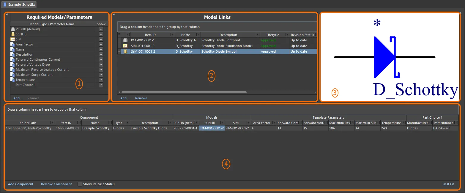
The Component Editor, when switched to operate in its Batch Component Editing mode, can be divided into four key regions.
-
Required Models/Parameters – where you define what type of domain models are required by the component definition(s), as well as the place to craft a set of parametric data that will be applied to all component definitions.
-
Model Links – where you add links to saved domain models, for use in component definitions.
-
Preview Window – providing a preview of the currently selected model. This will be graphical for a symbol and footprint, and textual for other model types.
-
Component Definition(s) – this is where a component is defined, including its folder, name, type, referenced domain models, parametric data, and part choice(s).
The
Required Models/Parameters and
Model Links regions can be horizontally collapsed by clicking the

control at the respective top-left. In addition, the top three regions can be collapsed, leaving just the
Component Definitions region by using the

control at the top-right.
Document Options
Controls for specifying the target Workspace folder in which the components will be created, and also the lifecycle definition and naming schemes to be employed for those components, are available in the Document Options dialog (Edit » Document Options). You also can define a default Component Naming scheme for components released from the Component Editor, ensuring a unique ID for each resulting component in the Workspace.
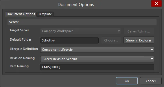
Workspace settings are defined through the Document Options dialog.
-
Target Server – if creating one or more new components, the target Workspace will be the one to which you are actively connected. When editing existing components, this field will reflect the Workspace in which those components reside. Click the Server Admin button to the right of the drop-down (available if the component(s) have yet to be released) to access the Data Management – Servers page of the Preferences dialog, from where you can browse and manage your active and known Workspace.
While you can be connected to various Workspaces, you can only be actively connected to one Workspace at a time.
-
Default Folder – when creating one or more new components, use this field to specify a default folder within the target Workspace in which to store the saved component(s). Do this by clicking the Choose button to access the Choose Folder dialog – an incarnation of the Explorer panel, from where you can browse to and choose an existing folder in the Workspace, or create a new one on-the-fly. The entry here will be used by default for the FolderPath when adding a new component definition. If editing the revision of one or more existing components, this field will reflect the existing folder and will be non-editable. In this case, the Choose button will also be unavailable. Click the Show in Explorer button to quickly browse to the specified default folder in the Explorer panel.
-
Lifecycle Definition and Revision Naming – use these fields to set a suitable default scheme in each case (Component Lifecycle and 1-Level Revision Scheme respectively). Use the drop-down associated with each field to choose a different scheme, from any of the currently defined schemes available for the parent Workspace.
If the option to control use of lifecycle definitions and revision naming schemes per content type is enabled for any definitions/schemes, and the Component content type is not set to use a particular definition/scheme, then that definition/scheme will not be available in the applicable drop-down list.
-
Item Naming – this field is used to define a default Item Naming Scheme for components saved from the Component Editor, ensuring a unique ID for each resulting Component Item in the Workspace. The entry here will be used as the template for automatically naming a newly-added component definition (in its associated Item ID field). The software will automatically assign the next available unique ID, based on that scheme, having scanned the entire Workspace and identifiers of existing content.
If the parent folder in which a component resides (or is being created) has a defined naming scheme, then this will be pre-filled as the default. If not, then the default scheme – CMP-{00000} – is provided. You can of course create your own scheme by typing it within the field. Support is available for the use of parameter-based Component Name Templates. Such templates allow you to precisely name, or rather rename your components, based on the currently defined values of parameters available to those components in the Component Editor. Include a parameter into the naming template using the format [<ParameterName>]. Multiple parameters can be used in a template, and you can also add an iterator macro, specified within curly braces (e.g., {000}, {00A}).
Alternatively, you can override the auto-assigned ID for a component by entering the ID required directly in the Item ID field for a definition. You always have full control and final say over how the Items are identified.
The dialog also provides the means to reference a defined Component Template. Choose a template using the controls available on the dialog's Template tab. A Component Template provides predefined settings for use by component definitions defined within the Component Editor. Any additional component definition that you add will be created in accordance with the associated component template.

If the components being edited reference a Component Template, the entries specified in the template for Lifecycle Definition, Revision Naming, Component Naming, and Default Folder are used to pre-fill the corresponding fields on the Document Options tab of the Document Options dialog. These options (on the Component editor side) will only be editable provided the corresponding Allow override option is enabled in the template. In addition, the target Workspace will be hard-coded to use the same Workspace as that in which the revision of the Component Template resides.
Required Models/Parameters
This region of the editor is used to specify which domain models are required by the component definition(s), as well as the place to craft a set of parametric data that will be applied to all component definitions.

Define required models and parameters.
-
Models – at the most basic level, a component used in board design requires representation in the schematic and PCB editing domains. It therefore needs schematic symbol and PCB footprint models. These then are added as required models by default and cannot be removed. Use the Add and Remove controls for the region to add/remove other model types as required.
Specifying a model type does not mean the component definition has to use it, but rather adds a field for that model type to the component's definition.
Notice that the PCBLIB entry is available from the list. This allows for a component to have different PCB footprint models associated with it. In addition, the PCBLIB (default) parameter allows you to specify the default footprint model for a component.
-
Parameters – two default parameter entries exist –
Name and Description. These are system parameters. Any number of additional parameters may also be added as required. To do so, click the Add control at the bottom of the region, then choose the Parameter entry. A new parameter will be added to the list. Click inside the Parameter Name field to change the name as required. To remove a parameter, select it and click the Remove control. The system parameters cannot be removed.
The Show option associated with an entry allows you to toggle the display of the corresponding column for that model/parameter in the lower region of the editor – where the component definitions themselves are defined. This can be a tremendous help where numerous parameters have been defined, and the region starts to become highly congested. Use multi-select in combination with the right-click menu options to toggle the display state of multiple models/parameters.
This region of the editor, through the Add menu, also facilitates the following:
-
Linking to a Component Template – the Templates sub-menu lists all Component Templates currently available in the same Workspace in which the component itself resides. Click on an entry to create a link to the latest revision of that Component Template. Parameters from the template will be brought into this region, and are distinguished by use of the  icon.
icon.
Parameter List Templates
If you are not using Component Templates, you can still create predefined listings of parameters through the Component Editor's support for customizable Parameter List Templates. These simple, humanly-readable files can be built with a list of required parameters, that can then be loaded into the editor with a single click.
Component Templates offer a far more powerful approach to organizing not only a set of parameters but also required models and the ability to define component types. In addition, it is only through Component Templates that you can define unit-aware parameters for your components, which are needed for the
advanced component searching functionality. To this end, if you have at least one component template present in your Workspace, the parameter list templates functionality will be disabled, and you will not be able to see and load these templates into the Component Editor.
Parameter list templates can be found in the Templates sub-menu – accessed by clicking the Add control at the bottom of the Required Models/Parameters region. A number of predefined templates are available, covering parameter sets associated with capacitors (Capacitor), resistors (Resistor), diodes (Diode) and transistors (Transistor).
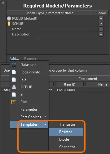
Access parameter templates from the menu associated to the region's Add control.
Click on the template you wish to use – the parameters defined within that template will be added to the region.
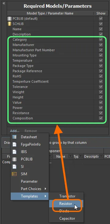
Adding a set of parameters for use by your component(s) is expedited through the use of parameter templates.
A parameter template is defined in a Component Library Template file (*.cmplib_template). To be recognized by the system, and therefore appear in the Templates sub-menu within the Component Editor, these files must reside in the Templates folder of your Altium Designer installation (\Users\Public\Documents\Altium\AD<Solution/Version>\Templates for a default installation).
The template definition is straightforward, consisting of the name for the template (as it is to appear in the sub-menu) enclosed in square brackets, followed by a listing of the required parameters, in the format <ParameterName>=. By way of example, the predefined template for resistors – resistor.cmplib_template – has the following definition:
[Resistor]

				Category=

				Manufacturer=

				Manufacturer Part Number=1

				Mounting Type=

				Temperature=

				Package Type=

				Package Reference=

				RoHS=

				Temperature Coefficient=

				Tolerance=

				Weight=

				Height=

				Value=

				Power=

				Resistance=

				Composition=
The '=' sign is required to have the parameter added to the list of Required Models/Parameters when the template is used. If it is removed in the template file, leaving just the parameter name, it will be excluded when the parameters are added.
Any number of parameter templates may be defined within a single template file. This can be seen in the file group.cmplib_template, which contains the templates for capacitors and diodes.
If the same template ([<TemplateName>]) is defined more than once in the same .cmplib_template file, only the first instance will be used. The software also ensures that there is no duplication of parameters where parameters from more than one template are added. If a parameter to be added is already existing with an exact matching name, it is ignored when that template is loaded.
-
Enabling the use of Datasheets – choose the Datasheet entry to do this. For more detail, see Attaching Datasheets to Component Definitions.
-
Adding Part Choices – use the Part Choices sub-menu, and choose By MPN. An entry will be added – Part Choice n – to the definitions area, with two columns – Manufacturer and Part Number, with which to specify the choice. Alternatively, if your Workspace supports it and you have configured a custom database part source, choose the By Internal ID menu entry. An entry will be added – Part Choice n – to the definitions area, with two columns – Part source and Internal ID, with which to specify the choice of part from your company's internal parts database. For more information, see Part Choices.
Model Links
This region of the editor is used to add links to saved domain models, for use in component definitions. The Model Links region can be thought of in terms of a 'bucket' of domain models that can be accessed by any component definition. Assignment is a case of specifying which links are required for each definition.
Links to models of a particular type can only be added, provided that model type has been added to the Required Models/Parameters region.

The Model Links region, packed with functionality to streamline model link definition and assignment to the component definitions.
Use the following collapsible sections to learn more about working with model links.
Adding Model Links
There are a couple of streamlined ways in which to add model links to the region:
-
Select models from within a given Workspace folder. You can choose one or more different models, or one or more different revisions of the same model. Click the Add control beneath the Model Links region, choose the model type, then choose the actual model(s) through the Choose Models dialog.
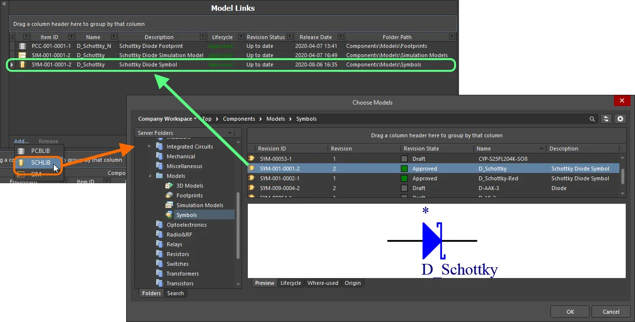
Dialog-based addition of model links.
-
Drag and drop models directly from the Explorer panel. You can drag one or more different models, or one or more different revisions of the same model.
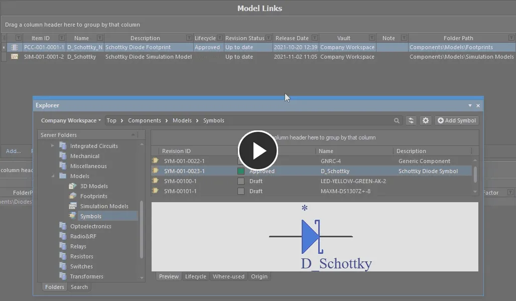
Add one, or multiple models, through drag and drop from the Explorer panel.
Any number of model links may be added, including links to different revisions of the same model. Each link is to a specific named-revision of a model (e.g. SYM-001-0023-1, for revision 1 of symbol SYM-001-0023). Using the Show In Explorer command on the right-click menu for a selected model link will quickly access the Explorer panel, with the chosen model (and revision thereof) in focus.
To change a model link, click on its Item ID field, then click on the  button. The Choose Model dialog will appear, from where you can browse for and choose, a different model, or a different revision of that same model. To remove a model link, select it and click the Remove control.
If the component references a component template, all models that are defined (as dedicated parameters) in that template (SCHLIB and PCBLIB(s) only), will be brought in and listed in the
Model Links region. For more information, see
Referencing a Component Template.
Out of Date Models
The Revision Status field for a model link is used to indicate whether it is the latest revision of that particular model, or if there is a subsequent revision available for it. When the Component Editor detects that a linked model is not the latest revision, this is flagged by the text Out of date, shown in a bold font.
To update the link to use the latest revision of the model, right-click anywhere on the model's entry and choose Update to Latest Revision from the menu. This action:
-
Updates the model link to reference the latest revision.
-
Updates any usage of that model in a component definition, to use the latest revision of that model.
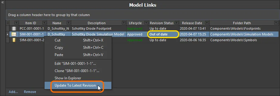
The Component Editor details any model that is not at the latest revision, right-click to update to the latest revision.
Direct Editing of Linked Models
Should you need to edit a linked domain model that is being used (referenced) by a component definition, this can be done most efficiently using the direct editing paradigm:
-
Right-click on the model entry in the Model Links region of the editor and choose the Edit command from the context menu.
-
The model will open in a temporary instance of its associated editor. Make changes as required to the model and save into the next revision of its parent item in the Workspace, using the Save to Server command (from the File main menu or the Quick Access Bar, shortcut Ctrl+Alt+S). The Create Revision dialog will appear, in which you can enter a different Name and/or Description, or enter a note of the changes made in the Release Notes field.
Discard any changes and come out of editing by using the Discard Local Changes command, also available from the File main menu and the Quick Access Bar.
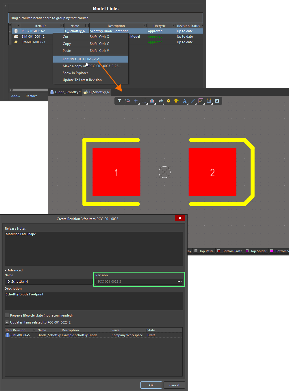
Edit and save a model directly from the Model Links region of the Component Editor.
The Create Revision dialog provides the ability to update all component revisions that reference this changed model revision. However, this is typically used when editing a domain model directly, and not through the model links of a component currently being edited itself. While this could be left checked, proceeding will open another editing instance for the component you are currently defining – or a combined editing instance including all affected component revisions, where multiple components reference the changed model. This could get quite confusing, so it is far better to disable this option before proceeding.
Clicking OK in the Create Revision dialog (with the option to update affected items disabled) will affect saving. The temporary model editor will close and you will be returned to your (already open) Component Editor. The model link and any instance where that link has been assigned to defined components will be automatically updated with this latest revision.
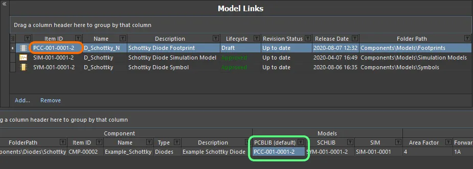
Model link and assignments are updated with the latest revision after the release process completes.
Making a Copy of a Model Link
To make a copy of an existing referenced domain model, select it in the Model Links list, right-click, and choose the Make a Copy command from the context menu. The process flow is similar to that followed when making a copy of an Item Revision in the Explorer panel:
-
A direct editing session is launched, with a copy of the source document – stored with the chosen model link's Item-Revision – opened in the associated (and temporary) editor.
-
Make changes as required through the editor – including changing the name and description, if/as required.
-
Select the Save to Server command (from the File main menu or the Quick Access Bar, shortcut Ctrl+Alt+S), to save the document to the Workspace (shortcut Ctrl+Alt+S). The Create Item dialog will appear. By default, the copy model will adopt the same revision naming and lifecycle definition schemes as the original model, and will be created in the same folder. These properties can be changed if required. Notice also that the original model Item-Revision ID is entered into the Ancestor Revision field.
-
Once the Item properties are set as required, click OK. The new Item and its initial revision will be created, the document released, and the temporary editor closed. The copy Item Revision will be added as a referenced link at the bottom of the list of Model Links, back in the Component Editor.

The newly copied Item Revision will be added as an additional model link.
Controlling the Display of Columns
To enable or disable the display of a specific column, click the Column Control button  and disable any columns you do not want to be visible.
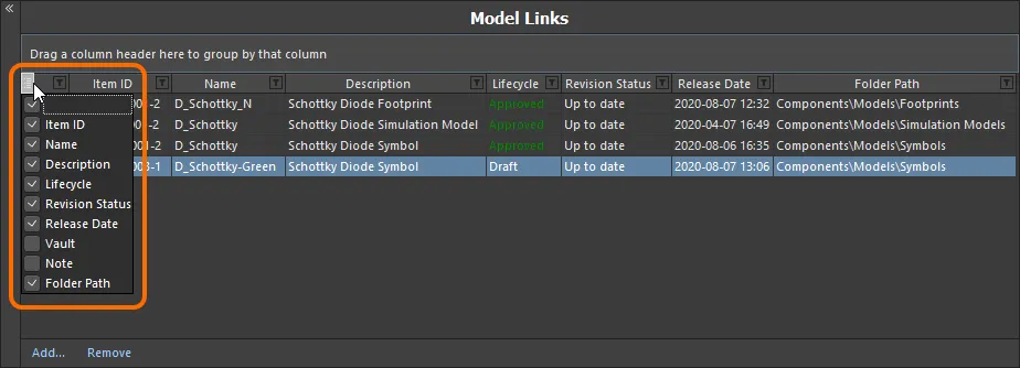
Hide or show model link data columns as required.
Alternatively, to hide a column, click and drag its header to a point in free space, until a large cross appears, then let go.
The order of the columns is customizable. Click on a column's header and drag it horizontally to the required new position. Valid positions are highlighted by vertical positional arrows.
With the exception of the column containing the icon for the model type, the width of a column can be modified by clicking and dragging the right-hand separator (in that column's header). If columns stretch beyond the extents of the viewable area, a horizontal scrollbar will appear.
Grouping Model Links
Model links can be grouped based on any of the visible column headings. To do this, click and hold on a column header, then drag and drop it onto the text that says Drag a column header here to group by that column.
For example, the following image illustrates the model links being grouped by Revision Status. Doing so separates the model links into as many groups as there are different values in the grouping column – in this case two groups are created, for Revision Status: Out of date, and Revision Status: Up to date.
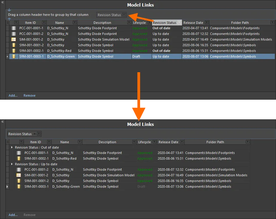
Grouping the model links based on the values in a column, in this case by Revision Status.
A hierarchy of groups can be created, by nesting the column headers. Within the grouped columns region, use drag and drop to redefine the grouping 'sort order' as required.
Sorting
Model links can be sorted by a specific column by clicking on that column's header. Click once to sort in ascending order (based on the content of that column). Click again to sort in descending order.
You can sort by multiple columns. With the model links already sorted by a specific column, Shift+Click on another column to 'sub-sort' by the content of that column.
To remove sorting for a column, Ctrl+Click on its header.
Column-based Filtering
Like an Excel spreadsheet, the model links can be further filtered by the contents of each column. To do this, click the small funnel (filter) icon, located at the right-hand side of a column header ( ). A menu will appear containing a checkbox for each value present in that column. Enable the required checkbox(es) to reduce the list to only include model links with that value.
Alternatively, for greater filtering control select (Custom...), which displays the Custom Filter dialog. Use this dialog to setup a custom filter to meet your requirements, by specifying which rows of information you want to show based on filter criteria you apply to the data column.
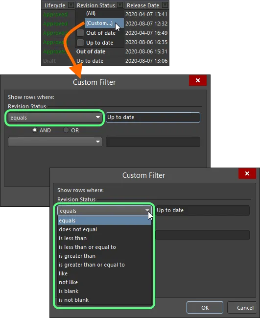
Choose to apply standard or customized column filtering.
When a column filter is applied, the filter icon is displayed in blue ( ), indicating that there is filtering applied based on that column. Filtering can be applied to multiple data columns. Each 'column filter' becomes an ANDed condition in the overall filter. A textual representation of the filtering currently in effect will be presented at the bottom of the region.
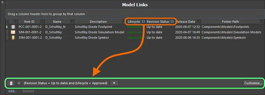
An example of column filtering in action.
To clear filtering for a column, choose the
(All) entry from the filtering drop-down. To clear filtering completely, click the

button, to the left of the textual representation of the filter. To disable the filter, uncheck the check box to the left of its textual representation. To enable again, check the check box.
Within an editing session, the history of just used filters is available. Click the

button to the right of the textual representation of the current filter to display the history. The history list is cleared when the temporary Component Editor is closed.
To further customize the current filter, click the  button, to the far right of the textual representation of the filter, to open the Filter Builder dialog. Use this dialog to create more sophisticated and complex filters as needed.
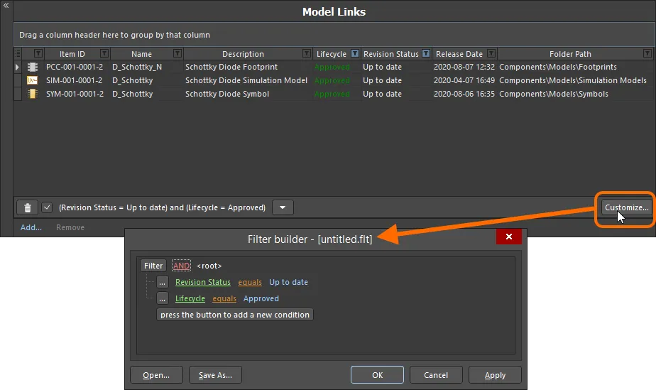
Use the Filter Builder dialog to create more sophisticated filtering.
Commonly used filters can be saved and re-used. This is done in the
Filter Builder dialog by clicking the

button to save the current filter in a
Filters file (
*.flt). Click the

button to reload a previously saved filter.
Component Definitions
Once you have specified the set of parameters, and have your 'bucket' of model links at the ready, you can proceed with definition of the required component(s). This is performed in this lower region of the document.

Define your components in a logical and intuitive way using the Component Editor.
What is actually presented in this region initially, will depend on the component(s) being edited:
-
When creating a new component, and a Component Template is not referenced from the parent folder, the entry will have the FolderPath and Item ID assigned, but that's it – a blank canvas as it were.
-
When creating a new component, and a Component Template is referenced from the parent folder, the entry will have prefilled definition information provided by that template.
-
When editing a revision of an existing, single component, and you have switched from Single Component Editing mode, that revision will be presented, along with whatever information has been defined for it at that stage.
-
When editing multiple chosen revisions of components – and thereby accessing Batch Component Editing mode directly – all of those revisions will be presented.
Add an additional new component definition to the list by clicking the
Add Component control at the bottom of the region, by choosing the
Edit » Add Component command from the main menus or by using the corresponding command of the same name on the region's right-click context menu.
Each component definition appears as a single row entry containing the following information:
-
Component: FolderPath – use this field to save the component to a specific folder in the target Workspace. For each newly added component to the grid, this field can be populated with a default location, if specified in the Default Folder field in the Document Options dialog (Edit » Document Options). Whether or not a default path is specified, you have full control over where in the target Workspace a component will be stored. To manually specify a target folder, click once inside the FolderPath field for a component to reveal the  button, and click to access the Choose Folder dialog. Browse to, and choose an existing folder, or create a new one on-the-fly.
Taking the time to carefully determine folder paths for your components ensures they are saved into the correct destination folders from the outset. However, content can be easily moved to any folder in the Workspace structure, post save, if need be.
This field will be read-only if the component has already been saved to the Workspace. If you use the Clear Link To Target Item command (on the right-click Operations sub-menu), the link to the existing Item in the Workspace will be cleared. The fields of the component definition will revert back ready to create a new Item, and the FolderPath field will become available for editing.
-
Component: Item ID – this field is used to determine the ID used for the saved component in the Workspace. For each newly added component to the grid, this field is populated in accordance with a default naming scheme, specified in the Item Naming field in the Document Options dialog. The software will automatically assign the next available unique ID, based on that scheme, having scanned the entire Workspace and identifiers of existing content.
A default Item naming scheme – CMP-{00000} – is provided, but you can of course create your own scheme by typing it within the field, ensuring that the variable portion is enclosed in curly braces (e.g. CMP-001-{0000}). Alternatively, you can override the auto-assigned ID for a component by entering the ID required directly in the Item ID field for a definition. You always have full control and final say over how the Items are identified.
Support is also available for the use of parameter-based
Component Name Templates. Such templates allow you to precisely name, or rather rename your components, based on the currently defined values of parameters available to those components in the Component Editor.
This field will be read-only if the component has already been saved to the Workspace. If you use the Clear Link To Target Item command (on the right-click Operations sub-menu), the link to the existing Item in the Workspace will be cleared. The fields of the component definition will revert back ready to create a new Item, and the Item ID field will become available for editing.
-
Component: Name – reflects the humanly-readable name given to the component. This system parameter is available and indexed when searching within the Workspace and will provide a good means to locate specific components beyond having to remember their Item ID.
The field will populate with any default value for the Name system parameter that has been defined in a referenced Component Template.
-
Component: Type – this field supports the ability to define the type of component and is a key attribute used to facilitate targeted searching of Workspace components (and which you will use heavily when browsing your components through the Components panel). Click on this field, then click  to access the Choose component type dialog. Use this dialog to select the required type of component (from all currently defined types) then click OK – the chosen type will be inserted as the value for the Type attribute in the main definitions grid.
The field will populate with any default value for the
ComponentType parameter that has been defined in a referenced Component Template, or with the component type selected through the
Create new component dialog, which appears when you attempt to create a new component using the
File » New » Component command. The types are defined at the preferences level. Click the

button at the bottom of the
Choose component type dialog to access the
Data Management – Component Types page of the
Preferences dialog, from where you can craft this listing to better suit your needs – either by adding new types and sub-types, or editing and removing existing types.
-
Component: Description – reflects the description added to the component. This system parameter is available and indexed when searching within the Workspace.
The field will populate with any default value for the Description system parameter that has been defined in a referenced Component Template.
-
Models – these fields correspond to the entries in the Required Models/Parameters region of the document. There is one field per required model that is added, with the exception of footprint models, where multiple can be defined. Each field is used to specify which of the linked models (in the Model Links region) is to be used for the component.
Toggle the display of model columns by enabling/disabling the associated Show option for a Required Model entry respectively. Use multi-select in combination with the right-click menu options to toggle the display state of multiple model types.
Note that a harness wiring model can be added to a component definition only when no other models are added to this component. And vice-versa, other type models cannot be added when a harness wiring model is added to the component.
-
Template Parameters – these fields correspond to user parameters brought into the Component Editor from a referenced Component Template revision. There is one field per parameter. The left-to-right ordering of the parameters in a component definition corresponds to their top-to-bottom ordering in the Required Models/Parameters region. Enter or select values for parameters as required, and where applicable. For example, parameters that have been marked Read Only in the template will not be editable, while other parameters will be. And if they have been marked as Required in the template, they must be given a value, or you will not be able to save the component definition to the Workspace.
-
Parameters – these fields correspond to the additional user parameters that you have entered in the Required Models/Parameters region of the document. There is one field per additional parameter. The left-to-right ordering of the parameters in a component definition corresponds to their top-to-bottom ordering in the Required Models/Parameters region. Enter values for parameters as required.
Dynamic (item-level) parameters are not visible when using the Component Editor in its Batch Component Editing mode but they are when using the Component Editor in its Single Component Editing mode – learn more.
-
Release: Current Rev. – this non-editable field reflects the current (most recent/latest) revision of the component in the Workspace.
-
Release: Next Rev. – this non-editable field reflects the next revision of the component that will be created when the component definition is next saved to the Workspace, in accordance with the chosen revision naming scheme.
-
Release: Action – this field shows the action that will be taken by the release manager for this particular component definition, as part of the saving process. For a component definition that has not yet been saved to the Workspace, this entry will display Create Item. For a definition that has already been saved to the Workspace, this entry will display Create Revision. If a planned revision of a component is being targeted, then the entry will display Release To Existing Revision.
-
Part Choice n – this entry corresponds to a Part Choice that you have added to the Required Models/Parameters region of the document. The left-to-right ordering of the Part Choices in a component definition corresponds to their top-to-bottom ordering in the Required Models/Parameters region. There are two fields per added Part Choice, Manufacturer and Part Number, with which to specify the choice. Alternatively, if you have configured a custom database part source, and added a Part Choice using the By Internal ID menu entry, the two fields will be Part source and Internal ID. Use these to specify the choice of part from your company's internal parts database.
The Current Rev., Next Rev., and Action fields – which collectively form the Release Status – can be toggled with respect to their display in the region, using the Show Release Status option, located at the bottom of the region. Toggle the display of Template Parameter, Parameter, and Part Choice columns by enabling/disabling the associated Show option for a Required Parameter entry respectively. Use multi-select in combination with the right-click menu options to toggle the display state of multiple parameters.
When you attempt to save a component back to the Workspace, the Component Editor runs a validation – a
Component Rule Check. This feature can also be run at any time, manually, by choosing the
Tools » Component Rule Check command, from the main menus. Be sure to have saved your component(s) locally (
File » Save) before you do. For more information, see
Running a Component Rule Check.
Working with Component Definitions
Use the following sections to learn more about working with this region of the editor, including some cool and time-saving features and functionality.
Assigning Model Links to Existing Components
For existing component definitions, the required model links can be assigned in the following ways:
-
Drag and drop a model link into the relevant column of a component definition.
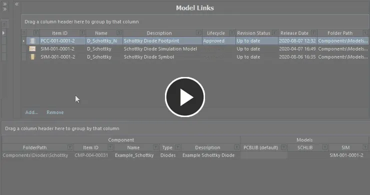
Assign a model to an existing component using drag and drop from the Model Links region to the corresponding model column for that component.
-
Use the drop-down field for a model column to access a dedicated model link pop-up window. This presents a grid of all existing model links applicable to the model type being assigned, complete with all data columns. This can be a real time saver for finding and assigning a model, where the number of component definitions hamper drag and drop techniques, or the top section of the Component Editor – housing the Model Links region – is collapsed. And this method can be used to assign the same model link to multiple component definitions – just select the model column for each component before accessing the pop-up window.
Resize the window as required. Click and drag the  control at the bottom-right of the window to resize in both directions simultaneously. Click the column control button
  at the top-left of the window and disable any columns you do not want to be visible. Columns can be reordered by dragging a column header.
Use the pop-up's search field to quickly locate the model required. Dynamic highlighting based on data across any column is applied as you start to type characters. Select the model link required and either press Enter or double-click to assign that model.
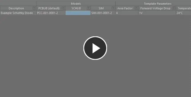
Use the dedicated model link selection pop-up to search, locate and assign the model required.
Creating a New Component with a Linked Model
Where a component definition does not yet exist, one can be created, along with the required model link automatically assigned, in the following ways:
-
Drag and drop a model link from the Model Links region, into free space within the Definitions region, to add a new component definition that uses that model.
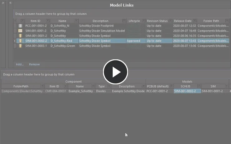
Assign a model and add a new component on-the-fly, using drag and drop from the Model Links region.
-
Drag and drop a model directly from the Explorer panel into the Definition region. A new component definition using that model will be added. In addition, if that model does not exist in the Model Links region, an entry will be added for it.
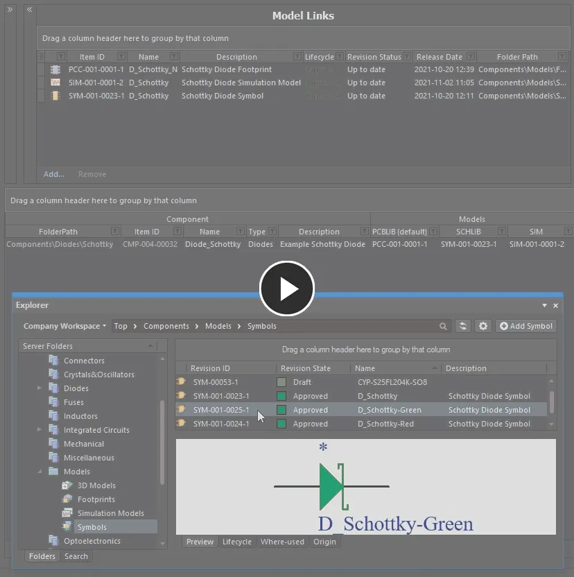
Assign a model and add a new component on-the-fly, using drag and drop from the Explorer panel. The model link will be added to the Model Links region, if it does not exist already.
Adding Multiple Components
The Component Editor facilitates addition of multiple new components in one hit. Right-click and choose the Operations » Add Components command. Then, in the Add Components dialog that is presented, enter the number of components you wish to add and click OK - new component definitions for the specified number of components will be added to the component definitions grid, at the bottom of the current list of component definitions. In concert with the grids multi-cell editing support, and copy/paste features, you can quickly build an impressive array of component definitions in quick time.
The command can also be accessed from the editor's main Edit menu (Edit » Operations » Add Components).
Be advised that entering too large a number in the Add Components dialog can have an impact on performance, and may 'tie' the software for a considerable time while the request is processed!
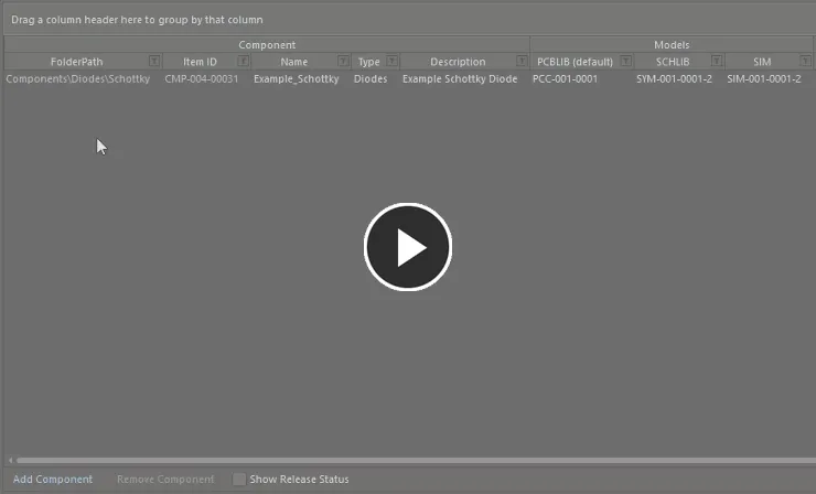
Add multiple new component definitions in two quick steps.
Generating Basic Chip Resistors
You can also quickly create a batch of chip resistor component definitions by choosing the Edit » Operations » Generate Basic Chip Resistors command from the main menus or by right-clicking over the definitions region, away from any currently defined definitions, and choosing the Operations » Generate Basic Chip Resistors command from the context menu.
The command only becomes available on the respective menu provided no component definition is currently selected.
After launching the command, component definitions will be automatically generated for the indicated component type.
The component definitions generated by running this command will be added to those already defined. In other words, the latter are not overwritten by generation of the former.
Creating Components from a Manufacturer Part Search
Providing a boost to the creation of components, Altium Designer supports the ability to search for a real-world part, courtesy of Manufacturer Part Search functionality, and then add that part into the Component Editor. Not only do you get a new component definition entry for the selected part, but you also get all of its parameters, any datasheets, and a part choice made based on it – leaving you to just organize some domain models, set the component type, target folder, and then save to the Workspace!
Note that unlike the use of the Manufacturer Part Search feature when using the Component Editor in Single Component Editing mode, in Batch Component Editing mode models (where they exist) will not be brought in.
To access this functionality in Altium Designer, the Component From Supplier Search software extension must be installed. This extension is installed with Altium Designer by default. It can be installed or removed manually.
For more information about managing extensions, refer to the Extending Your Installation page (Altium Designer Develop, Altium Designer Agile, Altium Designer).
The feature is accessed from the Component Editor's Definitions region. Right-click and choose the Operations » Create from Part Search command from the region's context menu. Alternatively, choose the Edit » Operations » Create from Part Search command from the main menus or click within the definitions area and use the keyboard shortcut Shift+Ctrl+M.
The Manufacturer Part Search dialog will appear. Search for the required part (or parts) across databases of real-world manufactured items that are offered by currently enabled Suppliers, select an entry, then click the OK button.
Search results in the dialog are by Manufacturer Part, with the associated SPN entries reflective of the enabled vendors supplying that part. When you select a part, it is the manufacturer part that is used to create the new component definition. And in terms of Part Choice, by creating based on the manufacturer part, and not a specific vendor/supplier, you get a single Part Choice that will bring with it all solutions based on the suppliers vending that part (and who are available for use through your Workspace). Parameters are imported in accordance with defined
Parameter Import Options – configured on the
Data Management – Parts Providers page of the
Preferences dialog.
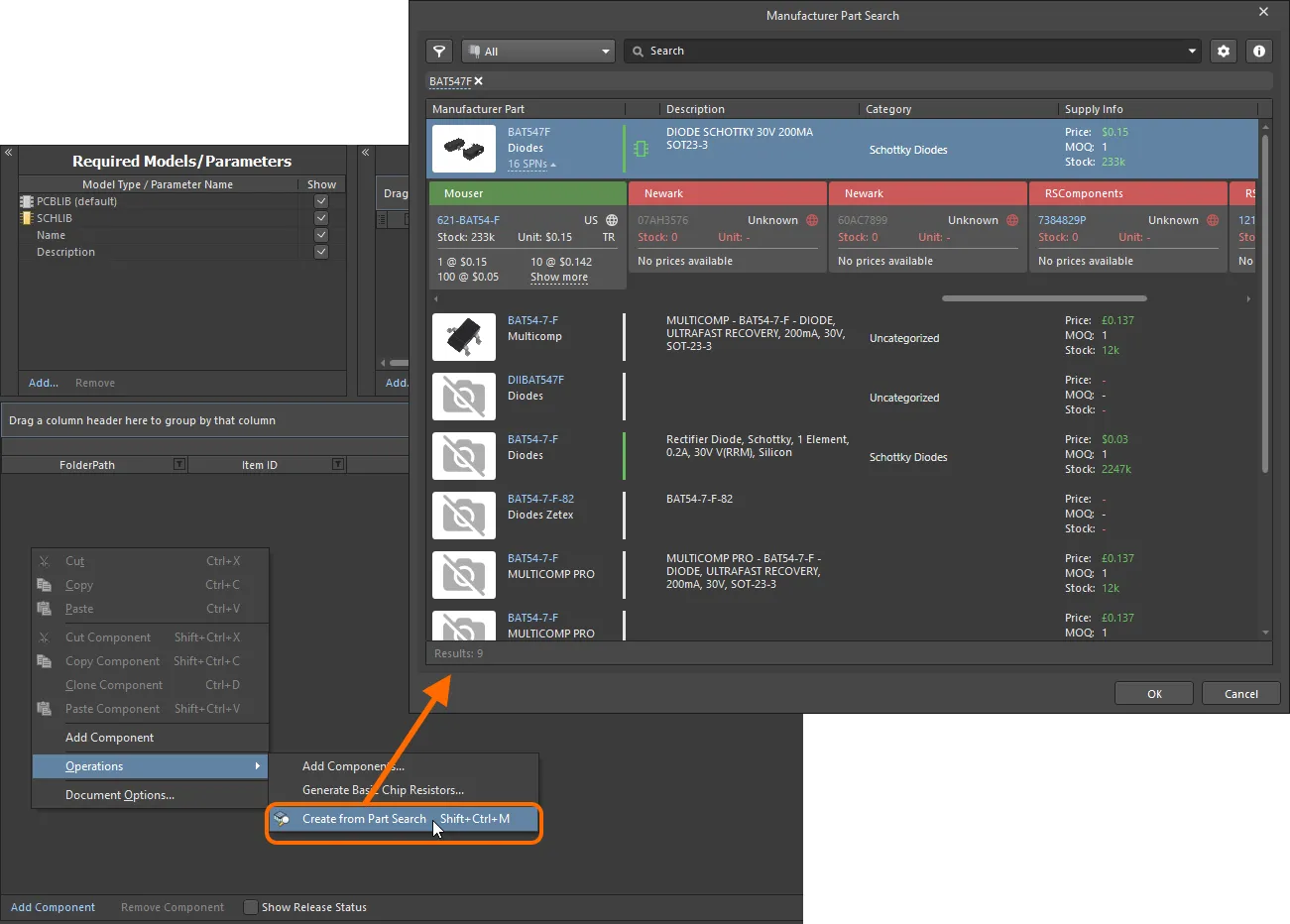
Access the Manufacturer Part Search dialog, and search for a part you'd like to bring in to the Component Editor.
After clicking OK, the following will occur:
-
A component entry for the selected part will be created in the definitions area of the Component Editor. The definition will:
-
Be assigned the next available unique Item ID, and in accordance with the defined Item Naming scheme employed by the Component Editor.
-
Have the value for the selected part's Manufacturer Part Number parameter assigned as the value for its
Name system parameter.
-
Have the value for the selected part's Description parameter assigned as the value for its
Description system parameter.
-
All parameters defined for the selected part (as visible for it in the dialog) will be added to the Required Models/Parameters list. All will be made visible (associated Show option enabled). This just means a column will be displayed for each, by default, in the Definitions region.
-
Parametric entries will also be added for each datasheet available for the selected part (in the form of a
ComponentLinknDescription and ComponentLinknURL pairing).
-
A Part Choice (
Part Choice 1) will be added for the definition, with the values for the part's Manufacturer and Manufacturer Part Number parameters used to fill the Manufacturer and Part Number fields of that choice respectively.
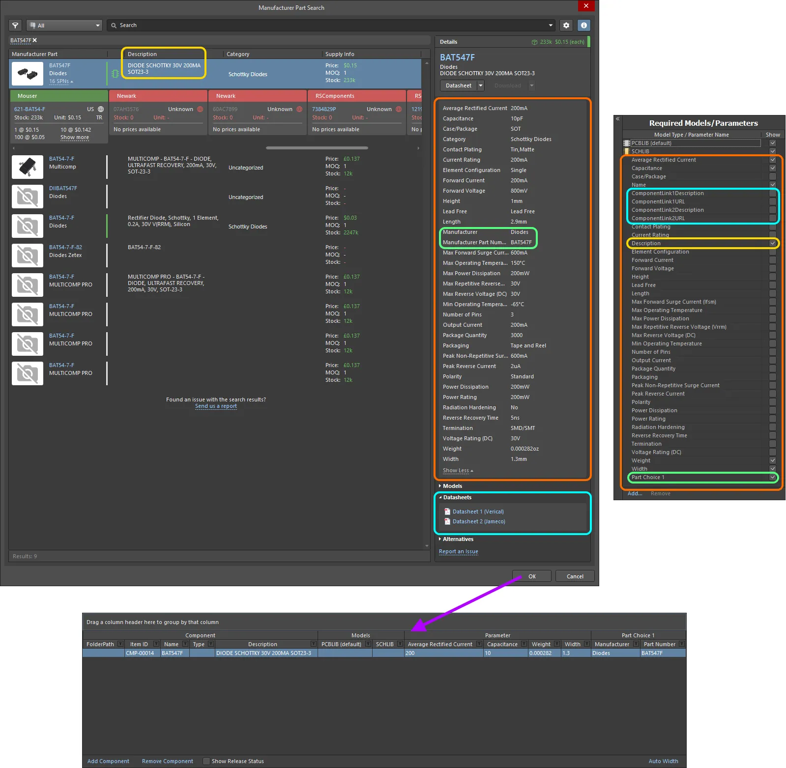
Example of the resulting definition, and added parameters, for a selected part in the Manufacturer Part Search dialog. Highlighting is used to show the data that is brought in from the Manufacturer Part.
Setting the Component Type
The Component Editor supports the ability to define the type of component when configuring a component's definition. This facilitates targeted searching through the Workspace's powerful Search facility – a facility that not only allows you to search by component type, but allows you to search smarter, with supported unit-aware component parameters. When browsing your own Workspace library using the Components panel, the Categories grouping for components is derived from the component type defined for each component.
The type of component is specified through the Type attribute in the Component region of the definitions area. Click on the Type field then click  to access the Choose component type dialog. Use this dialog to select the required type of component then click OK – the chosen type will be inserted as the value for the Type attribute in the main definitions grid.
The
Choose component type dialog presents a default set of component types. The types are defined at the preferences level. Click the

button at the bottom of the dialog to access the
Data Management – Component Types page of the
Preferences dialog, from where you can craft this listing to better suit your needs – either by adding new types and sub-types, or editing and removing existing types.
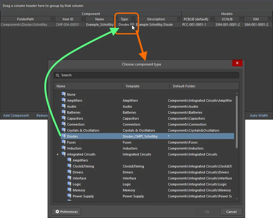
Example of setting the Type attribute for a component definition to Diode.
The Type field for multiple component definitions can be set in a single action. Select the Type field for each required component definition, then choose the type for one, to apply to all others.
It is also possible to change the component type for one or more components after saving to a completely different type, on-the-fly. In the
Components panel or
Explorer panel, select the component(s) that you want to change, then right-click and choose the
Operations » Change Component Type command from the context menu. The
Choose component type dialog will appear from which you can select the new component type.
The field will populate with any default value for the ComponentType parameter that has been defined in a referenced Component Template, or with the component type selected through the Create new component dialog, which appears when you attempt to create a new component using the File » New » Component command.
Support for Unit-aware Component Parameter Data Types
The Component Editor supports unit-aware component parameter data types that are defined within a referenced Component Template. You can enter a parameter's value directly into the applicable field for a component definition using a range of formats – such as 2.2k, 2k2, 4M, 2.5GHz – with the Workspace engineered with the requisite smarts to recognize the numerical value behind those entries.
This feature of a component template facilitates targeted searching through the Workspace's Search facility – a facility that not only allows you to search by component type but allows you to search smarter, with range searches. Using the power of unit-aware component parameters, you can quickly define a search, for example, to find all capacitors with a capacitance between 47uF and 220uF.
Unit-aware parameters are also used for smart filtering when searching through your own components using the
Components panel.
Unit-aware data types for component parameters can only be defined through a component template.
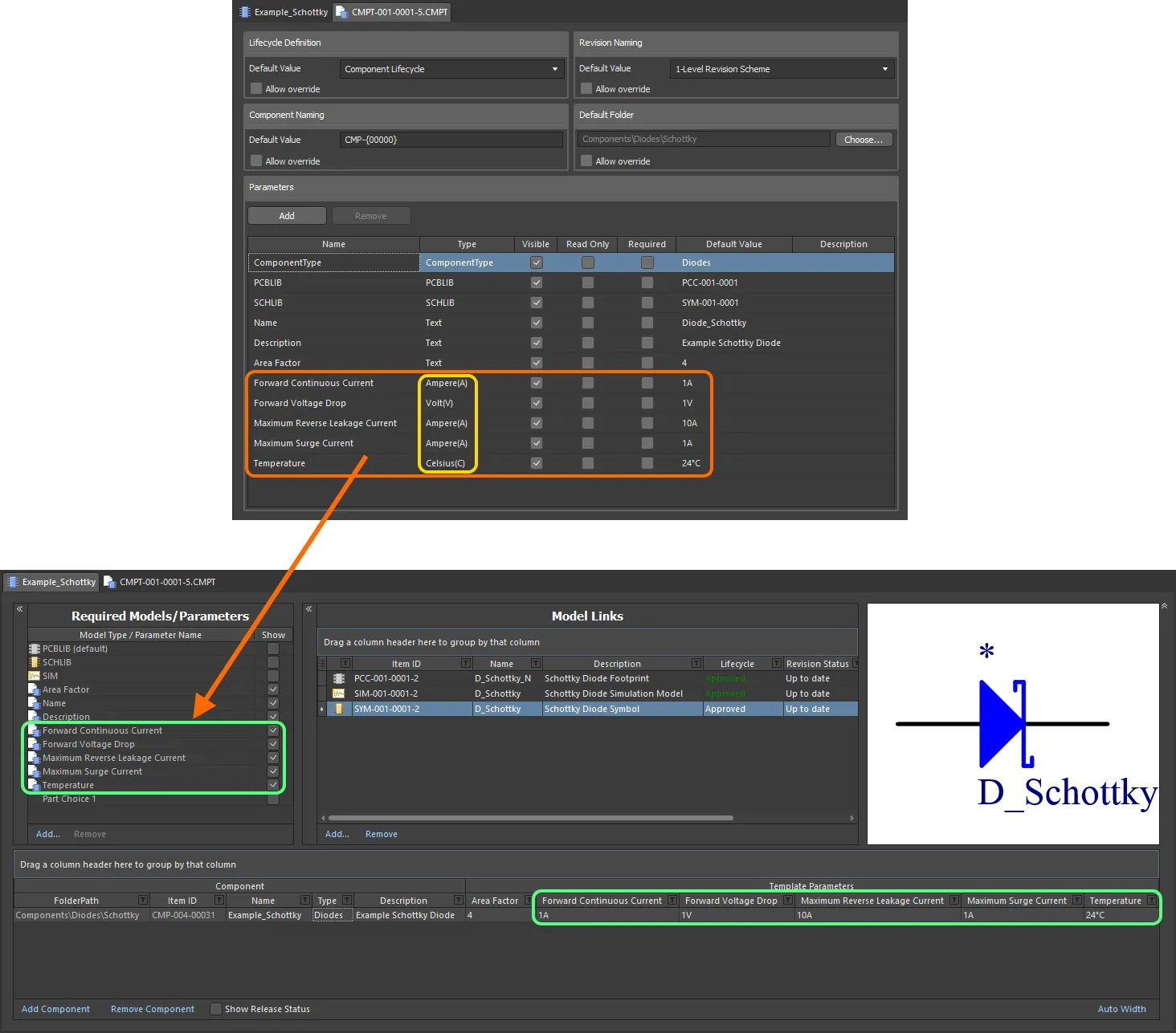
Component parameters from a referenced component template that have unit-aware data types.
When entering a value for a component parameter that uses a unit-aware data type – as the required value in a component definition – the following are things to consider:
-
You can enter the value in a range of different formats:
-
Numerical value only (e.g.
10). Note that if the data type has a unit, this will be applied automatically. Those types with units, have the unit in brackets after their name.
-
Numerical value in scientific notation (e.g.
1e10, 1E6).
-
Numerical value and units (e.g.
10F).
-
Numerical value with prefix (e.g.
10k). The appropriate unit will automatically be added (where applicable).
-
Numerical value with prefix and units (e.g.
10kF).
-
Numerical value with prefix in typical engineering format (e.g. for a resistance:
2k2, 2K2, 10r2, 10R2). The value will automatically be normalized accordingly (e.g. 2K2 will become 2.2k).
-
You can enter prefix and/or units with or without a space after the numerical value (e.g.,
10uF, or 10 uF). The space will be automatically stripped.
Note that engineering abbreviations are case insensitive, so entering 2k2 is the same as entering 2K2, and entering 100R is the same as entering 100r. The only exception is M (Mega) and m (milli).
Supported Units
The following unit-aware data types are supported:
Most data types have a unit (shown in brackets in the Component Template). This will be applied if no unit is specified when entering a value for a parameter.
-
Volt(V)
-
Ampere(A)
-
Ohm
-
Farad(F)
-
Henry(H)
-
Watts(W)
-
Hertz(Hz)
-
Celsius(C)
-
Decibel(dB)
-
Percent(%)
-
Metre(m)
-
Gram(g)
-
Second(s)
Supported Prefixes
The following table lists the prefixes that are supported when entering a value for a unit-aware parameter type.
| Prefix |
Term |
Value (Scientific) |
Value (Normal) |
| T |
Tera |
1 x 10¹² |
1,000,000,000,000 |
| G |
Giga |
1 x 10⁹ |
1,000,000,000 |
| M |
Mega |
1 x 10⁶ |
1,000,000 |
| k |
kilo |
1 x 10³ |
1,000 |
| m |
milli |
1 x 10⁻³ |
1 / 1,000 |
| u |
micro |
1 x 10⁻⁶ |
1 / 1,000,000 |
| n |
nano |
1 x 10⁻⁹ |
1 / 1,000,000,000 |
| p |
pico |
1 x 10-12 |
1 / 1,000,000,000,000 |
| f |
femto |
1 x 10-15 |
1 / 1,000,000,000,000,000 |
Note that the use of some, or all prefixes may not be applicable, depending on the parameter type. For example, no prefix is valid for a Percentage. The software will alert you to any invalid use of prefixes.
Validating a Parameter's Value
When a unit-aware data type is used for a component parameter, the entered value is validated against the specified data type. This ensures that the correct measurement unit for that data type is being used, where the unit is entered. For example, a parameter of type Celsius cannot have a value of 10V!
In the Component Editor, entering an invalid value for a parameter will cause that value to be highlighted in red text. This is also the case when copying and pasting data between cells.
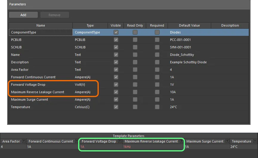
Data validation – the Component Editor has the smarts to alert you to a mismatch between the value entered for a unit-aware parameter, and its data type.
Support for Dictionary-defined Component Parameter Data Types
The Component Editor supports dictionary-defined component parameter data types that are configured within a referenced Component Template. You can select a parameter's value from the choices defined in the dictionary by clicking in the value cell and using the drop-down. You can click in the value cell and start typing a value – the drop-down will open, and the closest value will be highlighted in the list.
Dictionary-defined data types for component parameters can only be configured through a component template.
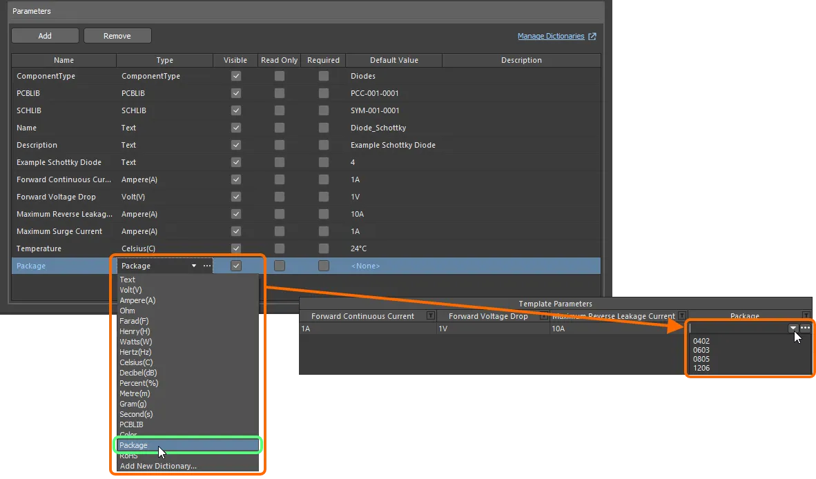
Component parameters from a referenced component template that have unit-aware data types.
If you are an administrator of the Workspace, click the  icon at the right of the value field to open the Settings – Vault – Dictionaries page of the Workspace's browser interface where you can manage the dictionaries.
-
Values of dictionary-defined parameters are validated upon saving the component to the Workspace. If the value becomes inconsistent with the dictionary (e.g., the value has been removed from the Workspace and then the component using that value was opened for editing), the value field will be highlighted red, alerting you to the fact that a value is inapplicable. You will not be able to save a component to the Workspace until values are consistent with dictionaries.
-
If dictionaries have been changed in the connected Workspace's browser interface, you need to disconnect from and reconnect to the Workspace in order to reflect these changes in Altium Designer. Refer to the Accessing Your Workspace page to learn more.
Using Component Name Templates
The Component Editor (in its Batch Component Editing mode only) provides support for the use of parameter-based Component Name Templates. Such templates allow you to precisely name, or rather rename your components – their Item ID – based on the currently defined values of parameters (user/template parameters – not system parameters) available to those components in the editor. Include a parameter into the naming template using the format [<ParameterName>]. Examples might be:
-
CMP-[Value]
-
CMP-[Part Number]
-
[Part Number]-[Value]
-
[Value]
-
[Part Number]
You can also use multiple parametric declarations in your templates, for example:
-
CMP-[Part Number]-[Value]
-
CMP-[Manufacturer Part Number]-[Value]-[Tolerance]
In addition, and purely optional, you can also add an iterator macro, specified within curly braces (e.g., {000}, {00A}), for example:
-
CMP-[Value]-{001}
-
CMP-[Part Number]-{00A}
At the highest level, the required naming template can simply be entered as the default naming scheme into the Item Naming field of the Document Options dialog. The initial index will always be zero in this case. For greater control, select the component(s) to be renamed and choose the Edit » Operations » Rename Component (Edit » Operations » Rename n Components) command from the main menus, or right-click and choose the Operations » Rename Component (Operations » Rename n Components) command from the context menu. You will be presented with the Component Name Template dialog. Use this dialog to specify the required Naming Scheme, and control the Initial Index (where an iterator macro has been added to the template).
Note that the dialog will initially show the default naming scheme entered in the Document Options dialog. If you leave this scheme, you will not be able to change the Initial Index. The latter can only be changed if a different naming scheme is used.
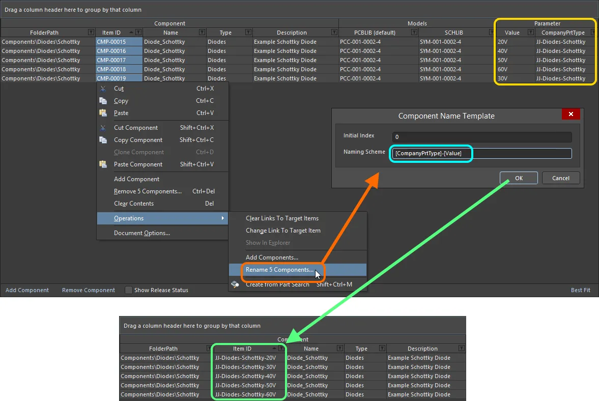
An example of the use of the CompanyPrtType and Value parameters in a naming template, to quickly rename selected components being defined in the Component Editor.
-
The naming scheme used in the renaming process is only used for that process. It does not replace the defined default naming scheme for the document. If you want additionally-added component definitions to be named using this same scheme, ensure that you define this scheme at the document level by changing the Component Naming field in the Document Options dialog accordingly.
-
The Item ID for an individual component definition can also be changed directly in the grid. Click once to focus the Item ID cell, then click again (or press F2) to enter in-place editing. Change the name as required. Note that the use of parametric declarations is not supported when directly editing the name in this way.
Part Choices
The Component Editor can be used to specify one or more Part Choices for a component – the 'allowed' manufacturer parts that can be used to implement the component on the assembled board. The actual supply chain intelligence – comprising Manufacturer (and part number), Supplier (and part number), Description, Pricing and Availability – is sourced from the Workspace's local Part Catalog and the relevant Part Source.
Each Workspace has its own dedicated Part Catalog. This is a local part catalog database, dedicated to the management and tracking of manufacturer parts and their associated supplier parts. The local Part Catalog stores items representative of actual Manufacturer Parts, along with one or more items representative of Supplier Parts – the incarnations of those Manufacturer Parts, as sold by the Suppliers/Vendors. Each Supplier Part is a reference to an item in a parts database – either the aggregate parts database of the Altium Parts Provider (which itself interfaces to, and gathers the parts from, enabled Suppliers) or, for an Enterprise Server Workspace, a linked local parts database (ODBC-based). Enable required Suppliers and determine Location/Currency ranges for the Altium Parts Provider within the Part Providers area of the Workspace's browser interface. While you remain connected to your Workspace from Altium Designer, the Altium Parts Options region – on the Data Management – Parts Providers page of the Preferences dialog – becomes read-only and adopts those settings defined for the Workspace. For more information on managing the Altium Parts Provider part source for your Workspace, see Part Source Configuration (Altium 365 Workspace, Enterprise Server Workspace).
Add a part choice from the Required Models/Parameters region – click the Add control and use the By MPN command from the Part Choices sub-menu. Alternatively, if you have configured a custom database part source, choose the By Internal ID menu entry. Any number of part choices can be added for use.
When you add a part choice for use with the component(s) being defined, an entry will be added – Part Choice n – to the definitions area, with two columns to specify that choice. These columns will depend on the style of part choice chosen:
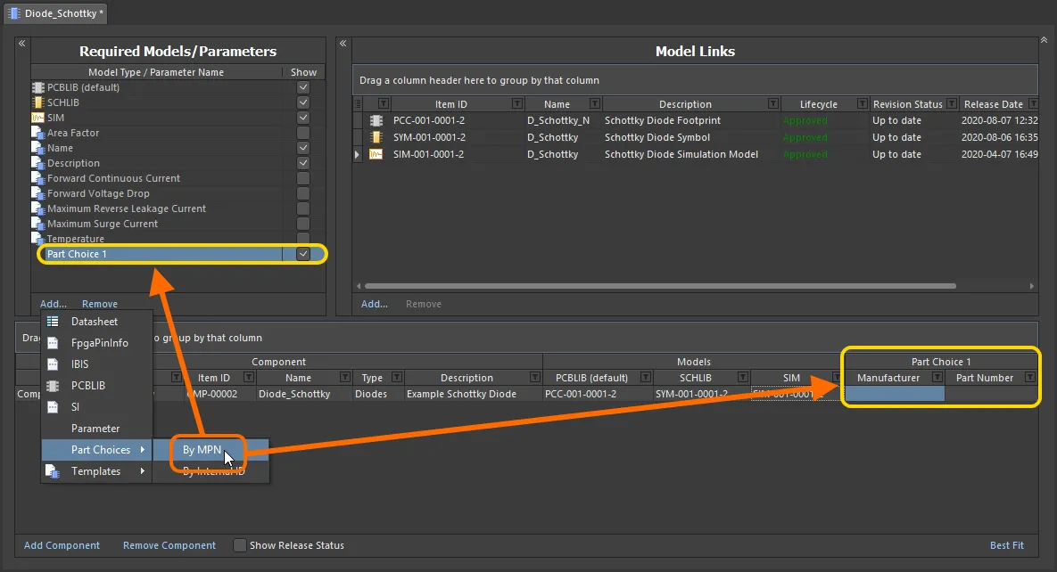
Adding a part choice (By MPN) for use with the component(s) being defined. Hover to see an example part choice added By Internal ID – allowing you to hook up a part from your company's internal parts database.
Enter the Manufacturer and Manufacturer Part Number – for the real-world part you want to be used when the board is manufactured and assembled – into the Manufacturer and Part Number fields respectively.
If using a configured custom database part source, use the Part source field to select the part source. All custom database part sources defined for the Workspace will be listed. Enter the ID for the required part, into the Internal ID field.
When accessing the Component editor in its Batch Component Editing mode, and a pair of manufacturer and manufacturer part number parameters is detected in a component, the Part Choice Migration dialog will open, with a suggestion to convert these parameters to part choices ( ). If you select to copy or move the parameters to part choices, new part choices will be created, with their Manufacturer and Part Number values defined by the values of the parameters.
Component parameters that are detected as the manufacturer and manufacturer part number are listed in the collapsible section below. If the parameter names have numeric suffixes (e.g., the parameters are named Manufacturer 1 and Manufacturer Part Number 1), these parameters will also be detected.
Manufacturer and Manufacturer Part Number Parameters
Parameters detected as the manufacturer name:
-
Manufacturer
-
ManufacturerName
-
Manufacturer Name
-
Mfg
Parameters detected as the manufacturer part number:
-
ManufacturerPartNumber
-
Manufacturer Part Number
-
ManufacturerPN
-
Manufacturer PN
-
MPN
-
PartNum
-
PartNumber
-
Part Number
-
PartNo
-
Part No
-
MfgPartNumber
A couple of things to be aware of:
-
The addition of a part choice does not mean a component definition has to use it. But if you do enter a value in one of the two fields, the other field will appear with a red border, alerting you to the fact that a value is now required before that component can be saved to the Workspace.

-
If you make an incorrect entry for a field value, and the part can not be retrieved by the Workspace, the text will appear greyed and in italics. Once both entries are correct, the text will appear as normal, white text. Note that values are case-insensitive.

Dialog-based Addition of MPN Part Choices
While you can enter the Manufacturer and Part Number information directly into the associated cells for a part choice, it is far easier to use a dialog that allows you to search for a manufacturer part. To 'get at' this functionality, after adding the initial Part Choice 1 entry to the Required Models/Parameters region, click within one of the cells for that choice (associated with the required component being defined). The Preview region of the editor will present the  button. Click this to access the Add Part Choices dialog, which is used in the same was as the Manufacturer Part Search panel (refer to this page for detail on the full UI elements).
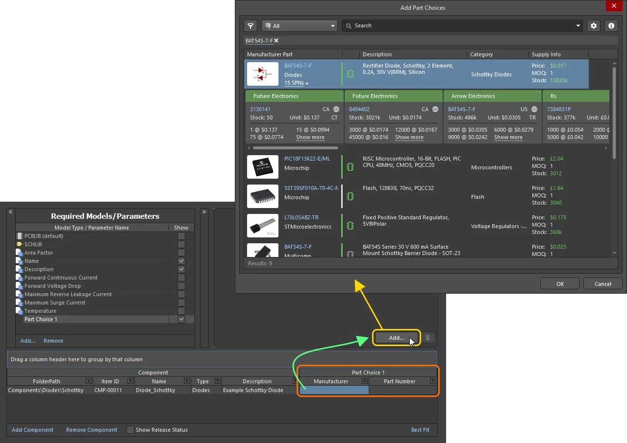
Making a part choice – use the Add Part Choices dialog to search for the required manufacturer part, select its entry and click OK.
Search results in the dialog are by Manufacturer Part, with the associated SPN entries reflective of the enabled vendors supplying that part. When you select a part, it is the manufacturer part that is added to the Part Choices list. And by using the manufacturer part, and not a specific vendor/supplier, you get a single Part Choice that will bring with it all solutions based on the suppliers vending that part (and who are available for use through your Workspace).
Use the dialog to search for the required manufacturer part, select a part, then click the OK button. Click the SPNs entry for a manufacturer part – Supplier Part Numbers – to see the available suppliers of that part, and assess whether you are making the right part choice, based on availability, pricing, etc. The chosen part will be entered back into the Component Editor – both in the cells of the Part Choice 1 entry, and in the Preview region.
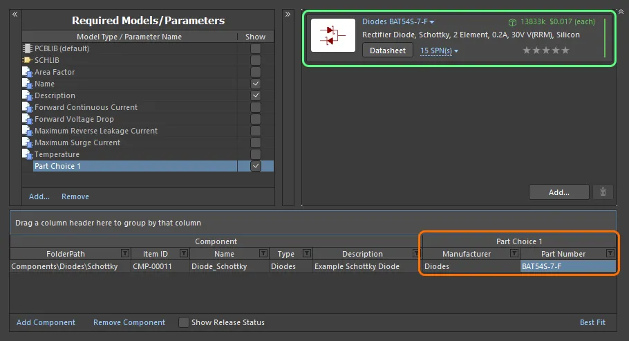
Example part choice – added through use of the Add Part Choices dialog – presented back in the Component Editor.
Continue to add further part choices as required by clicking the  button – the associated Part Choice n entry will be created automatically.
To remove a part choice, select it in the list, then click the  button.
Refer to the Adding Supply Chain Information to a Component page to learn more about information provided by a part choice.
Automatic Ranking of Part Choices
In addition to the ability to define a user rank for a part choice using the star feature, you can also set ranking for part choices automatically for components being defined/edited in the Component editor.
-
Select one or more component definition entries, then right-click the selection and choose the Set Part Choice Ranks Automatically command from the right-click menu to set ranking for part choices of selected components.
-
Select the Tools » Set Part Choice Ranks Automatically command from the main menus to set ranking for part choices of all components.

Part choices are sorted in the component definitions grid and the preview region of the editor according to the ranks set. Any part choices already ranked keep their existing order.
Attaching Datasheets to Component Definitions
One or more datasheets can be attached to one or more components while defining component(s) through the Component Editor. This, for example, allows you to quickly attach the same required datasheet(s) to all components in a particular family.

Linking various datasheets, as seen from the perspective of editing a component in the Component Editor.
Attaching datasheets to a component definition involves a sequence of steps, summarized here and detailed in the sections thereafter:
-
Enabling the use of datasheets.
-
Uploading datasheets to a selected component.
-
Assigning uploaded datasheets to other component definitions.
Enabling the Use of Datasheets
To be able to attach datasheets to a component definition in the editor, you need to first enable the use of datasheets. This is done from the Required Models/Parameters region of the editor. Click on the Add control at the bottom of the region, and choose Datasheet from the context menu.
Specifying the use of datasheets does not mean a component definition has to use it, but rather adds a field for datasheets to the component's definition.
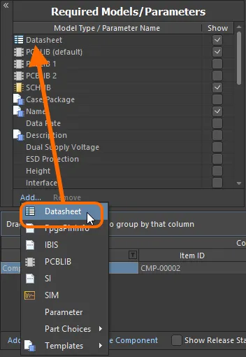
Enable the use of datasheets for components.
Remember that the Show option associated with the entry allows you to toggle the display of the corresponding Datasheets column in the lower region of the editor – where the component definitions themselves are defined.
Uploading Datasheets to a Selected Component
Having enabled the use of datasheets, you now need to upload them. Essentially, you upload any number of datasheets for the currently selected component, but can then assign all, or specific sheets, across the various components being defined. Once the Datasheet entity has been added to the Required Models/Parameters region, a Datasheet entry will be presented in the Model Links region. Clicking on this will show the list of datasheets currently assigned (linked) to the selected component, in the preview region.
The preview region will only show the datasheets linked to the selected component.
While the Datasheet entry appears in the Model Links region, it is not a model link in the true sense of the word. It is not a single Item, but rather a 'bucket' representing a summation of Datasheet Items into which datasheets are individually uploaded. It presents no other data attributes (no revisions, location, release status, etc).

The Datasheet 'bucket', and the available listing of uploaded datasheets. In reality, each datasheet is uploaded into a unique underlying Datasheet Item.
With a component definition selected in the editor, a datasheet can be uploaded to that component in various ways:
-
Dragging and dropping from Windows File Explorer to the preview region, or the Datasheets cell for that component definition.
-
Dragging and dropping a datasheet link from a web page in an external web browser, to the preview region, or the Datasheets cell for that component definition.
-
Right-clicking in the preview region and choosing the Add File command from the context menu. Use the Open dialog to browse to, and open, the required datasheet(s).
Once uploaded, you can:
-
Open a datasheet by clicking on its entry in the preview region (or by right-clicking on its entry and choosing Open from the context menu).
-
Change the caption for a datasheet, by right-clicking on its entry in the preview region and choosing Edit from the context menu. The Caption dialog will appear with which to do so. Changing a caption for a datasheet is local to that component.
-
Remove the datasheet from the component, by right-clicking on its entry in the preview region and choosing Delete from the context menu.
-
Download the file by right-clicking on its entry in the preview region and choosing Save As from the context menu.
Assigning Uploaded Datasheets to other Component Definitions
When you initially attach (upload) a datasheet, you are doing so for the currently selected component. But the beauty of the system is that all uploaded datasheets are available for linkage to other components being defined as well. Click the control at the right of the Datasheets cell to access a listing of the available datasheets, and use the associated checkboxes to attach/remove a datasheet to/from the component.
Only those datasheets uploaded during the session with the Component Editor will be available, and not all datasheets uploaded to components throughout the entire Workspace.
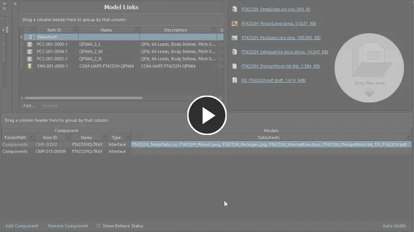
Example demonstrating attachment of datasheets that have already been uploaded, to another component definition.
Each datasheet that is assigned to a component appears in the Datasheets cell, separated by a comma.
Validation Checking of Component Naming
The software validates the IDs of components that are being created by multiple users for saving to a Workspace, and thereby prevent duplicated Item ID issues. When a user creates a Component Item, the assigned Item ID is 'locked', preventing another user from using that ID, even if the first user has not, or does not, save that component to the Workspace. If other users change the Item ID manually as part of their component definition – to one that is currently used by an existing Item (or an intended-to-be-created Item), the ID will be changed for the next available, unused ID, in accordance with the applicable naming scheme.
A locked Component Item ID will be released automatically after 30 minutes, if no saving has taken place within that time.
Making a Copy of a Component Definition
Facilitating the ability to quickly create component definitions that differ slightly from one another, the editor provides copying functionality. To make a copy of an existing definition, select it in the list of definitions and choose the Edit » Make a copy of the component command from the main menus or right-click and choose the Make a copy of the component command from the context menu (shortcut: Ctrl+D). The copy will be added to the bottom of the list of definitions.
The copy will be an exact replica of the original source component definition, in terms of:
-
Targeting the same folder within the Workspace – the folder in which the original component exists, or targets (if not itself saved as yet).
-
Referencing the same domain models.
-
Having the same values for Name, Description, Type, template parameters, and any additional user-defined parameters.
It will differ in terms of:
-
Not having any datasheets that were defined for the original component.
-
Not having any part choices that were defined for the original component.
-
Having the next available unique Item ID.
-
Being set to be saved into the initial revision of a new Component Item (Action set to Create Item).

An example of copying a component definition – once copied, make any changes as necessary, for example to the values of one or more parameters, defining part choices, and adding any datasheets as necessary.
Once copied, make any changes as necessary, e.g., to the values of one or more parameters.
The copying feature is similar to using the Copy Component and Paste Component commands in sequence. While a quicker means of copying an existing component definition, copying can only be performed on a single component definition, whereas Copy/Paste Component commands work on multiple definitions.
Grouping Component Definitions
Component definitions can be grouped based on any of the visible column headings. To do this, click and hold on a column header, then drag and drop it onto the text that says Drag a column header here to group by that column.
For example, the following image illustrates the component definitions being grouped by the Case-Metric parameter. Doing so separates the component definitions into as many groups as there are different values in the grouping column – in this case, nine groups are created.
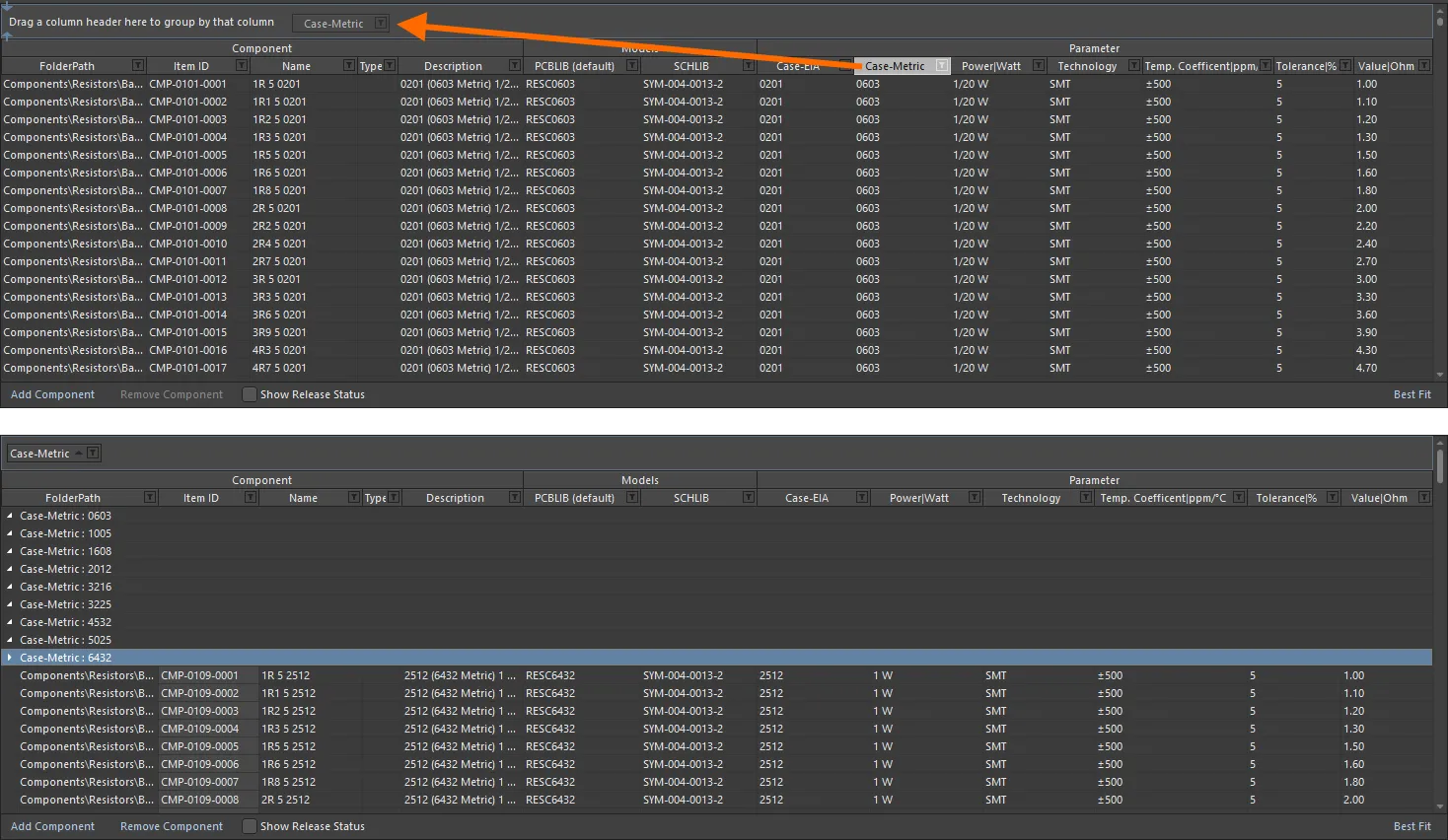
Grouping the component definitions based on the values in a column, in this case by the Case-Metric parameter.
A hierarchy of groups can be created, by nesting the column headers. Within the grouped columns region, use drag and drop to redefine the grouping 'sort order' as required.
Sorting Component Definitions
Component definitions can be sorted by a specific column by clicking on that column's header. Click once to sort in ascending order (based on the content of that column). Click again to sort in descending order.
You can sort by multiple columns. With the component definitions already sorted by a specific column, Shift+Click on another column to 'sub-sort' by the content of that column.
To remove sorting for a column, Ctrl+Click on its header.
Column-based Filtering of Component Definitions
Like an Excel spreadsheet, the component definitions can be further filtered by the contents of each column. To do this, click the small funnel (filter) icon, located at the right-hand side of a column header ( ). A menu will appear containing a checkbox for each value present in that column. Enable the required checkbox(es) to reduce the list to only include component definitions with that value.
Alternatively, for greater filtering control select (Custom...), which displays the Custom Filter dialog. Use this dialog to set up a custom filter to meet your requirements, by specifying which rows of information you want to show based on filter criteria you apply to the data column.
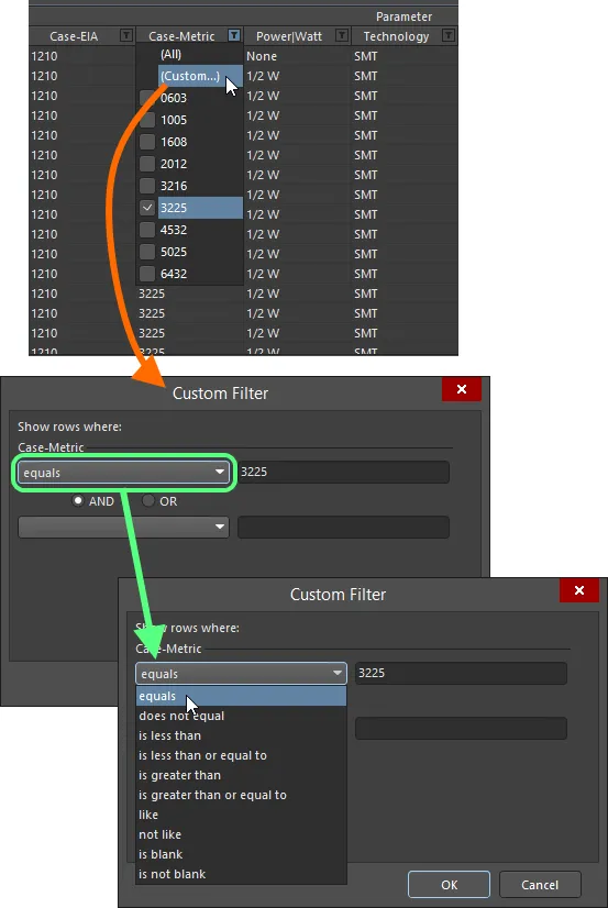
Choose to apply standard or customized column filtering.
When a column filter is applied, the filter icon is displayed in blue ( ), indicating that there is filtering applied based on that column. Filtering can be applied to multiple data columns. Each 'column filter' becomes an ANDed condition in the overall filter. A textual representation of the filtering currently in effect will be presented at the bottom of the region.
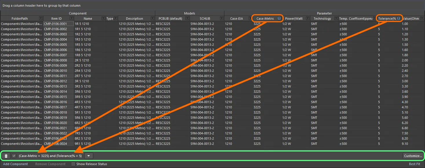
An example of column filtering in action.
To clear filtering for a column, choose the
(All) entry from the filtering drop-down. To clear filtering completely, click the

button, to the left of the textual representation of the filter. To disable the filter, uncheck the check box to the left of its textual representation. To enable again, check the check box.
Within an editing session, the history of just used filters is available. Click the

button to the right of the textual representation of the current filter to display the history. The history list is cleared when the temporary Component Editor is closed.
To further customize the current filter, click the  button, to the far right of the textual representation of the filter, to open the Filter Builder dialog.
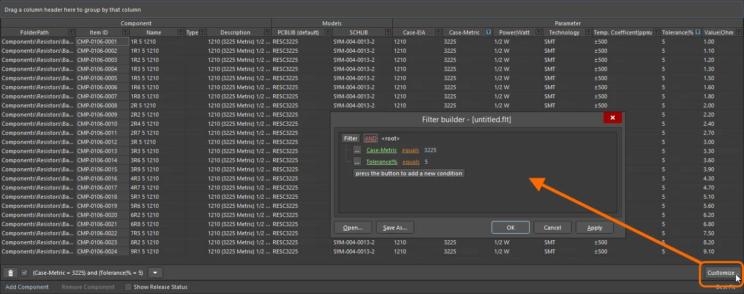
Use the Filter Builder dialog to create more sophisticated filtering.
Use this dialog to create more sophisticated and complex filters as needed:
-
Filter - click to access additional filter conditions. Click Clear All to clear all filters. Choices are:
-
Add Condition - click to add a filtering condition, such as equals, between, etc.
-
Add Group - click to add a filtering group, such as AND, OR, etc.
-
Links - click the various links to further define the filter.
-
Id - click the various links to choose the desired item by which to filter, for example, Description, Name, etc.
-
AND, etc. - click the various links to specify the logical operator/type, for example, OR, etc.
-
like - click the various links to specify the operator, such as equals, is blank, is greater than, etc.
-
<empty> - click the various links to add a condition value. Enter the desired value in the textbox after clicking the link.
-
press the button to add a new condition - click to add an additional condition.
Commonly used filters can be saved and re-used. This is done in the
Filter Builder dialog by clicking the

button to save the current filter in a
Filters file (
*.flt). Click the

button to reload a previously saved filter.
Presentation of Data
Depending on the type of components being defined, there could be a sizeable number of parameters, all of which, when added to the other columns of data, can create a veritable tangle of partially-legible content. Addressing this, a couple of display modes are available for the component definitions region. Switch between modes using the control at the bottom-right of the region.
The control presents the mode that will be enabled when clicking upon it, and not the currently enabled mode.
-
Best Fit – in this mode, each column of data is sized to display all data within it, in accordance with the largest data entry and adding a little padding for good measure. Since each column is sized to display its data, the columns can collectively extend beyond the currently viewable area. In support of this, a horizontal scrollbar is provided to allow ease of reading.
-
Auto Width – in this mode, the software will attempt to display all data columns within the viewable area of the grid, stretching or condensing as needed. This mode works fine when there are not so many data columns, but legibility can suffer when a greater number of columns are present.
Example use of the Auto Width and Best Fit presentation modes.
To further aid in the display of data, selectively toggle the display of model and parameter columns. Do this using the Show option for each, available in the Required Models/Parameters region of the editor.
You can also manually adjust the width of data columns to fine-tune display of your data – click and drag the right-hand edge of a column's header.
Component Definitions – Editing Techniques
Depending on the components you are creating, the Component Editor may end up containing a sizable number of component definitions. In some cases, these definitions may differ only slightly and many may require similar model or parametric information. The document supports various editing features that enable you to quickly effect changes to one or more component definitions.
-
Multi-cell editing is implemented for models and parameters. Multiple data cells within a column can be selected for operation using standard Ctrl+Click and Shift+Click keyboard functionality. To assign a model to multiple components, select the range of cells, then click the drop-down to display the model link pop-up window. Double-click on the required model in the pop-up, this model will then be assigned in all selected model cells.
For parameters, select the required cells within the same column, then enter the required value for the focused cell and either click away, or press Enter. All cells in the selection will receive that same value.
This feature can also be used for the
FolderPath. Select the entries in the
FolderPath column for the applicable component definitions, click the

button for the focused entry, and choose the required target folder in the
Choose Folder dialog. All selected definitions will have their
FolderPath changed to point to this folder.
-
You can cut, copy and paste data between selected data cells using Ctrl+X, Ctrl+C and Ctrl+V respectively (or the corresponding commands on the right-click menu or the main Edit menu).
If the target cell is incompatible with the clipboard data, the paste will not happen (for example, when pasting parametric data into a model link field).
-
You can clear the contents of selected data cells using the Delete key (or the Clear Contents command on the right-click menu or the Edit » Clear Contents command from the main menus).
If the Component Library document references a Component Template, keep in mind that:
-
If a parameter is marked as Read Only in the template, you cannot clear the contents of the applicable cell for that parameter.
-
If a parameter is marked as Required in the template, clearing the contents of the applicable cell for that parameter will cause the cell to be highlighted with a red border alerting you to the fact that a value is required.
-
You can copy, cut, and paste selected component definitions, using Ctrl+Shift+C, Ctrl+Shift+X and Ctrl+Shift+V respectively (or the corresponding commands on the right-click menu or the main Edit menu).
-
To quickly duplicate a single component definition, use the Make a copy of the component command.
-
Component definitions from the clipboard can be pasted in two ways into the main grid region of the Component Editor:
-
At the end of the current list of definitions - make sure there are no definitions currently selected then launch the command.
-
Overwriting a current definition - right-click over the definition to overwrite and launch the command. A dialog will appear asking you to confirm; click Yes to proceed. Any existing defined cell data will be overwritten with that from the pasted definition. Note that overwrite only works with the focused definition. If multiple definitions exist on the clipboard, only the first will be pasted 'over' the focused definition, with the remainder pasted at the bottom of the list of definitions.
-
You can remove selected component definitions completely, using the Remove Component control below the component definition grid, the Remove <ComponentName> (Remove n Components) command from the right-click menu or the main Edit menu, or the Ctrl+Del shortcut.
-
You can refresh the content of the grid using the Refresh command on the main Edit or View menu or the right-click menu of the main grid region, using the F5 keyboard shortcut, or by clicking the
 button on the Component Library Standard toolbar.
-
You can copy selected data cells to the Windows clipboard, for manipulation in an external spreadsheet application. Component definition information in an external spreadsheet can also be pasted back into the component definitions region.
It is also possible to collapse the upper region of the Component Editor by clicking the small arrow

at the upper right of the editor, thereby dedicating the entire display area to the editing of component definitions.
Browsing a Saved Definition
Once saved to the Workspace, you can browse a component directly in the Workspace using the Components panel, or the Explorer panel.
For a component that has already been saved, and is currently being edited, you can jump directly to its Component Item in the Workspace from the Component Editor, by right-clicking on its entry in the definitions area and choosing the Operations » Show in Explorer command or by choosing the Edit » Operations » Show In Explorer command from the main menus.
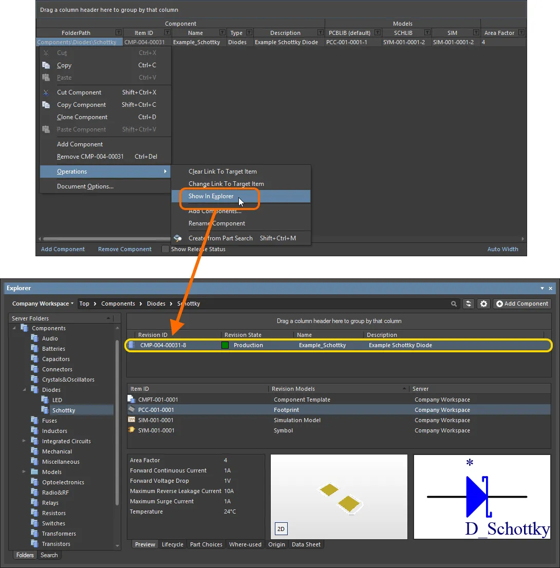
Jump to an already saved component in the Explorer panel, directly from the Component Editor when you have that component revision opened for editing.
Targeting an Existing Component Item
For the most part, you would typically leave the creation of the components in the target Workspace to be part of the saving process. You add your component definitions, assign Item IDs and away you go – content creation 'on-the-fly' as it were. However, you may have created (or want to create) components directly in the Workspace, then link to these existing components. Alternatively, you may want to change the target Component Item associated with an existing, released component definition.
The right-click Operations sub-menu associated with a component definition (and the Edit » Operations sub-menu of the main menus) contains a couple of commands to support linking a definition to a manually-created component:
-
Change Link To Target Item – use this command to access the Choose Target Item dialog, which you can use to browse for and select the required component in the Workspace.
If the selected component definition is already linked to a component, then the dialog will present this component, already selected. If the definition is not already linked, then the dialog will present the target folder (as defined for the definition).
Once linked to an existing component in the target Workspace, the Item ID for the component definition will become grayed-out (un-editable).
Note that the command will only be available on the respective menu when a component definition is selected. If multiple component definitions are selected, the command operates on the focused definition - distinguished by a dotted border around its selected cell.
-
Clear Link To Target Item (Clear Links To Target Items) – use this command to clear the link to existing component(s) in the Workspace. The Release-related fields of the component definition will revert back ready to create a new Item.
The need to sever the links might arise if you need to release again to a new set of components. For example, if you have previously released but then deleted the components from the Workspace, the source library will still have defined links (although invalid as the Workspace components would no longer be found).
If you have already saved a component definition, this procedure will effectively cause that definition and its previously linked component to lose knowledge of each other.
Once the link to an existing component in the target Workspace is cleared, the Item ID for the component definition will become editable. The entry in the Action field in the Release region of the grid will change to Create Item reflecting that the component definition is currently not linked to a component in the target Workspace.
Running a Component Rule Check
Before saving a Workspace Library component defined/edited in the Component Editor to the connected Workspace and making the component be available for use in designs, it is essential to make sure that this component meets the requirements in accordance with the configured settings. The Component Editor runs a validation – a Component Rule Check – when you attempt to save a component back to the Workspace or run this feature manually.
A Word About Linked Simulation Models
Related page: Creating a Simulation Model
As with symbol and footprint models, a component can also reference a revision of a simulation model. Adding a model link of this type is exactly the same as for a symbol and footprint, so refer back to the previous sections for information on that. Here, we look at including component-level simulation parameters, and also configuration of pin mapping.
Adding Component-Level Simulation Parameters
When using a simulation model for a component in a design, parameters specific to that model can be specified at two different levels:
-
Model-Level Parameter – specified as part of the simulation model definition itself (in the SimModel file), and saved with that definition into a revision of the linked simulation model.
-
Component-Level Parameter – specified as part of the component definition (here in the Component Editor), and saved with that definition into a revision of the linked component.
Component-level parameters are used for parameters that are shared between multiple models or where the designer wants to make such a parameter visible/editable on the schematic (e.g. value, frequency, etc).
Parameters are added at the component-level in the Required Models/Parameters region of the Component Editor. It is important to note that the naming of parameters must be the same as those parameters defined at the model-level. To see the model-level parameters, and therefore which parameters can be added at the component-level (and their names!), select the SIM model link and click the View Parameters control, at the bottom of the preview window.
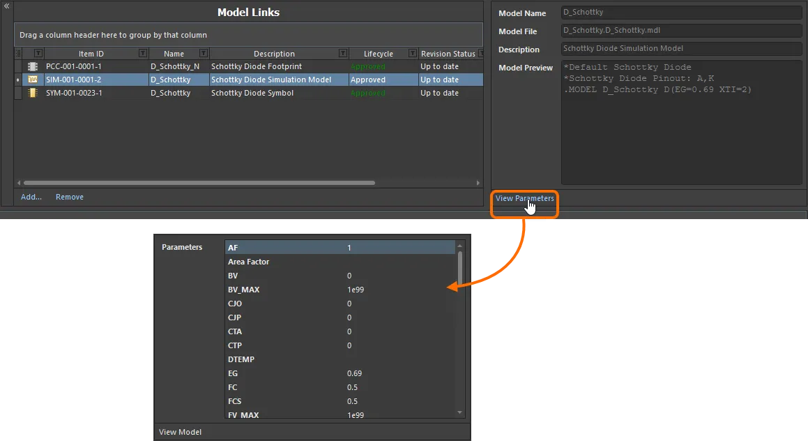
View the model-level parameters for a Simulation Model Item to see which parameters can be added at the component-level – and how they are named!
Armed with the available model-level parameters, you can now proceed to add any of those same parameters at the component-level – to be available to any component definition. To do so, click the Add control at the bottom of the Required Models/Parameters region, and choose Parameter from the menu. A new parameter entry will be added to the list. Change the name as required – remembering to match exactly the name of the corresponding model-level parameter.

Add sim-related parameters at the component-level. Notice that one parameter is already available – Area Factor – courtesy of the Component Template referenced by this example component.
When an instance of the saved component is placed in a design, a simulation parameter can have a different value at the component-level, to that for the same parameter at the model-level. When the netlist is generated, the component-level parameter will have priority.
For some of the built-in SPICE3f5 models, entering a value for a parameter at the component-level will override a related parameter defined in a linked model file (*.mdl). For a semiconductor capacitor, for example, specifying a value for the component-level Width parameter will override any value specified for the DEFW parameter in the associated model file. If a parameter is specified at the component-level for a subcircuit model, that value will override the value defined for it in the linked subcircuit file (*.ckt).
Pin Mapping
Once the link to the required SIM model has been chosen, you need to ensure that the pins of the component – when represented in the schematic domain – are correctly mapped to the pins of the simulation model. This is performed in the Pin Mapping dialog, accessed by right-clicking on the component definition's SIM model entry and choosing Operations » Edit Pin Mapping from the context menu or by selecting the cell for the SIM model, and choosing the Edit » Operations » Edit Pin Mapping command, from the main menus. For each schematic pin, use the available drop-down to change the associated Model Pin entry accordingly. If the device is multi-part, be sure to check the mapping for each part.

Ensuring correct schematic pin-to-model pin mapping.
For a multi-part component, the ability to exclude a part from simulation is also determined through the Pin Mapping dialog.
For the built-in SPICE3f5 and supported PSpice models, the function of each of the pins in a model can be found in the general form section for that model, in the SPICE 3f5 user manual. For subcircuit models, the manufacturer will typically insert comments for each pin of the model, describing that pin's function. If no commenting is evident, then the pinout of the model will typically be that of the physical device itself. Consult the datasheet for the device in this case.