This mode of the PCB panel can be used to create and edit differential pairs. Differential pairs can be added manually, through the Differential Pair Rule Wizard or created from nets.
The three regions of the Differential Pairs Editor mode of the PCB panel are:
- Differential pair classes.
- Individual member differential pairs within a class.
- The constituent nets (negative and positive) that form a differential pair.
As you click on an entry in a list, a filter will be applied based on that entry, the visual result of which is determined by the highlighting methods enabled (Mask/Dim/Normal, Select, Zoom). In this way, you can quickly highlight all differential pairs in a particular class, a particular differential pair, or a particular net that forms the negative or positive half of a differential pair. Multiple entries can be selected in each region using standard Shift+Click and Ctrl+Click features.
Right-clicking on a differential pair class entry then selecting Properties (or double-clicking on the entry directly) will open the Edit Differential Pair Class dialog in which you can rename or view/modify the differential pair membership of the class.
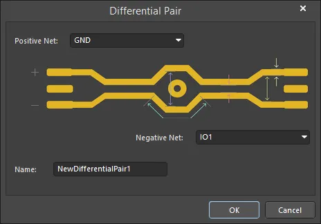
Right-click on a Differential Pair entry then select Properties or double-click on the entry directly to open the Differential Pair dialog in which you can view/modify the properties for differential pair name and its constituent nets.
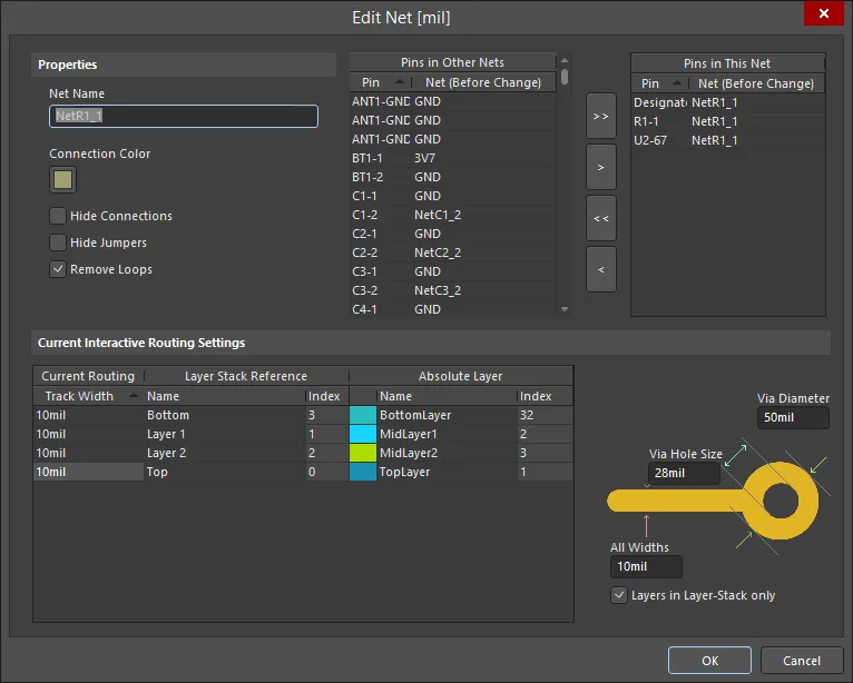
Right-click on a Net(s) entry in the PCB panel then selecting Properties (or double-clicking on the entry directly) will open the Edit Net dialog in which you can view/modify the properties of the net as required.

In the PCB panel, as you click on an entry in a list, a filter will be applied based on that entry. The visual result (in the design editor window) of the cumulative filter is determined by the highlighting methods enabled (Mask/Dim/Normal, Select, Zoom). Using these highlighting methods, you can quickly highlight all differential pairs in a particular class, a particular differential pair, or a particular net that forms the negative or positive half of a differential pair. Multiple entries can be selected in each region using standard Shift+Click and Ctrl+Click features.
Managing Differential Pairs
Use the Differential Pairs region of the panel to manage the differential pair objects in a design. For the particular differential pair class selected, all currently defined differential pair objects that belong to that class will be listed in this region.
Use the Add, Delete and Edit buttons at the bottom of this region to create new differential pair objects, or edit or delete existing ones. These three commands are also available from the right-click menu for the region. When adding a new differential pair, the Differential Pair dialog will open.

Use the dialog to define the pair object, in terms of a positive and negative net and a meaningful name. By default, the name will be set to NewDifferentialPair1 and the positive and negative nets will be set to the first and second available nets in the netlist for the design. Use the drop-down lists to select from the available nets.
Note that only available nets are listed for selection. Nets currently defined as part of existing differential pairs are not listed.
When editing an existing differential pair object, the Differential Pair dialog will open with the currently chosen nets for the pair entered into the Positive Net and Negative Net drop-down fields. Change one or both nets for the pair or rename the pair as required.
Creating Differential Pairs from Design Nets
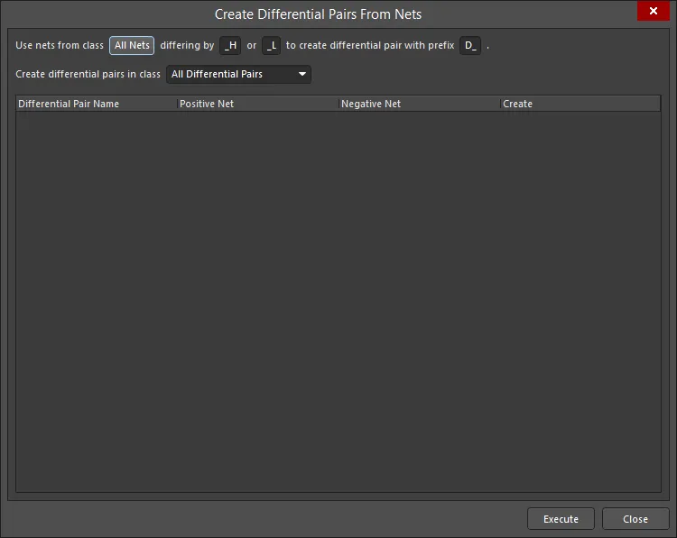
Differential pair objects can be automatically created from the nets in your design using the Create Differential Pairs From Nets dialog. This dialog is accessed by clicking on the Create From Nets button at the bottom of the Nets region of the PCB panel.

The effectiveness of this automated method directly depends on the naming convention that has been used for the specific nets that will make up the differential pairs. Ideally, a naming convention will be used so that a common root is followed by a consistent positive/negative indicator (P and N). For example, consider the receiver signal D_ETH_O.RX, which is a differential signal in the design. The two nets that constitute this signal are ETH_O.RX_P and ETH_O.RX_N - these represent the positive and negative sides of the signal, respectively.
The filters at the top of the dialog enable you to quickly target these nets in terms of the net class to which they belong and the particular differentiating factor that has been used to distinguish the positive and negative nets in an intended pairing, for example, _P and _N. You can also define a prefix to be added to the differential pair objects created, and also determine in which differential pair class they are to be added.
For each differential pair object, the dialog lists its constituent positive and negative nets. By default, all prospective differential pair objects are selected for the creation and individual ones can be excluded by clearing the associated Create checkbox.
When all options are set as required, click the Execute button - the differential pair objects will be created and the PCB panel will update accordingly.
Filtering will be applied to show the created pairs in the design space.
Configuring Applicable Design Rules
A Differential Pair Routing rule needs to be configured before routing a differential pair in a design. A differential routing rule defines:
- The preferred Gap between the network pair, and its permitted range.
- The maximum Uncoupled Length (the pair is uncoupled when the gap is wider than the maximum Gap setting).
- The preferred routing Width for each net.
- The optional gap/width setting variations for each layer in the stack.
- The scope (in terms of classes and objects) for the rule's application.
While rules can be created manually using the PCB Rules and Constraints Editor dialog, the PCB panel offers the convenience of the Differential Pair Rule Wizard dialog. Use the Rule Wizard button (below the Nets region in the PCB panel) to access the Wizard and implement the rule properties as required.

Note that the scope of the rules will depend on the selection in the PCB panel prior to launching the wizard, as follows:
Differential Pair Class
If the All Differential Pairs class is selected, the scope will be All for each rule.
If a specific differential pair class is selected, the scope will be InDifferentialPairClass('ClassName') for each rule.
Differential Pair
If a single differential pair object is selected in the panel, the scope will be:
- Width -
InDifferentialPair('PairName')
If multiple differential pair objects are selected in the panel, there will be individual scope entries for each pair object, each separated by an 'Or' operator. For example, a routing Width rule targeting individually selected differential pair objects D_ETH_O.TX and D_ETH_O.RX will have a scope of:
InDifferentialPair('D_ETH_O.TX') Or InDifferentialPair('D_ETH_O.RX')
Note that the clearance from a net in a differential pair to any other electrical object that is not a part of the pair is monitored by the applicable Clearance rule.
To edit the configuration of an existing Differential Pairs Routing rule, including its scope, open the PCB Rules and Constraints Editor dialog (Home | Design Rules) then navigate to Routing - Differential Pairs Routing.